ON PHYSIO
Brand Design, Web Design, Print Design, 2025
ON PHYSIO is a practice for orthopaedic and neurological physiotherapy in Hamburg-Bergedorf, run by Martina Dziegielewicz and René Kuntz.
I designed the complete brand identity for the practice: logo, colour palette and typography, the website, print materials from business cards to the practice sign, and a template system for social media.
How It Went
- July 2024, Referral: A friend recommended me to Martina and René. In a short call with no strings attached we worked out what the new practice needed, and then I sent my proposal. Back then I was still freelancing on the side.
- September 2024, Kick-off: In a kick-off video call with both founders we went through everything about the practice. With the opening coming up fast, the order was clear: brand first, then the website.
- October 2024, Brand: I presented the logo in two rounds, followed by colours and typography.
- November to December 2024, Website: Right after that I designed the website and built it in Wix Studio, along with business cards and the Google and WhatsApp profiles. That way the practice was online in time for the opening.
- January to May 2025, Print: Much of the print work came after the opening, one piece at a time: folded card and NFC card, poster, practice signs and social media templates.
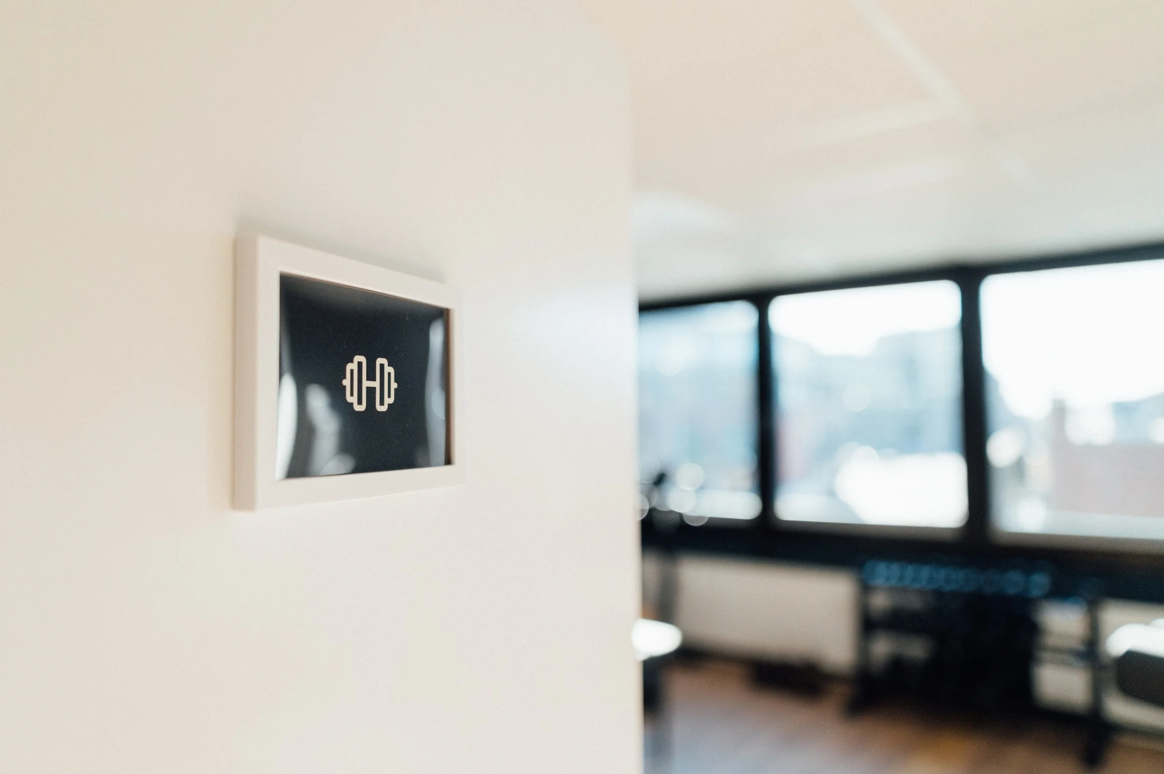
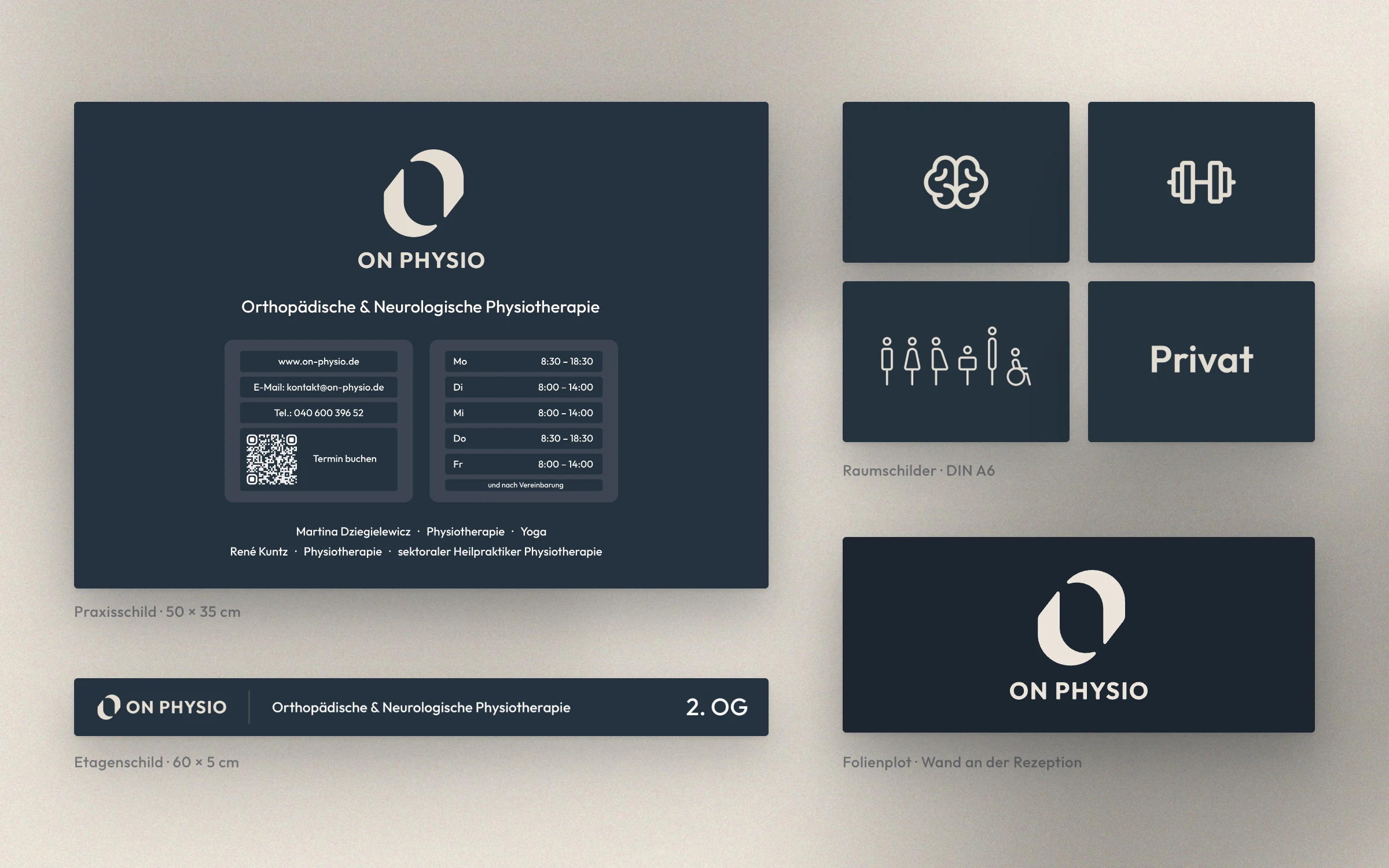
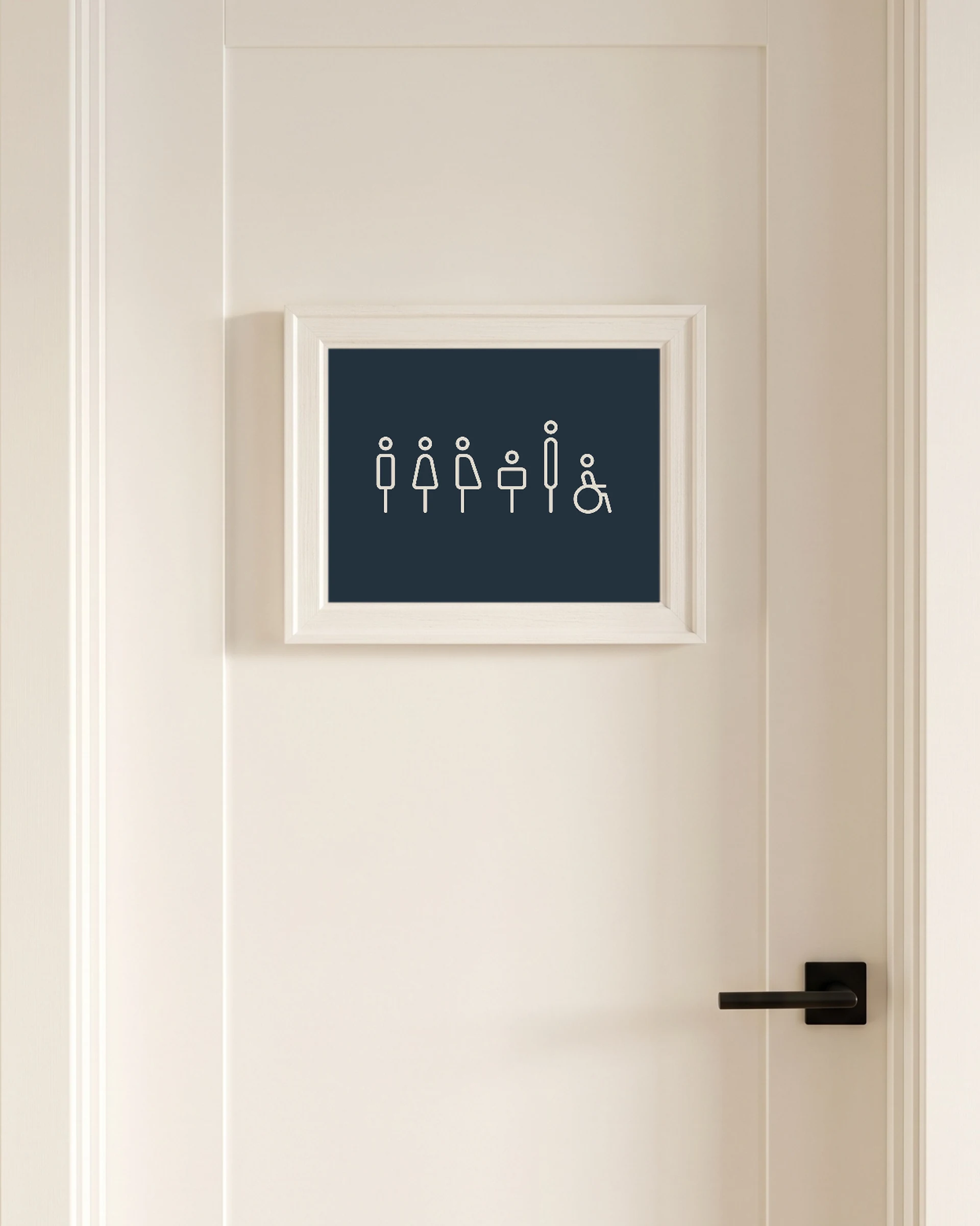
- 2026, To This Day: Whenever the practice needs something new, I am still their contact, most recently for icons on the signs around the practice, for example on the doors to the neurology area and the toilets.
Logo
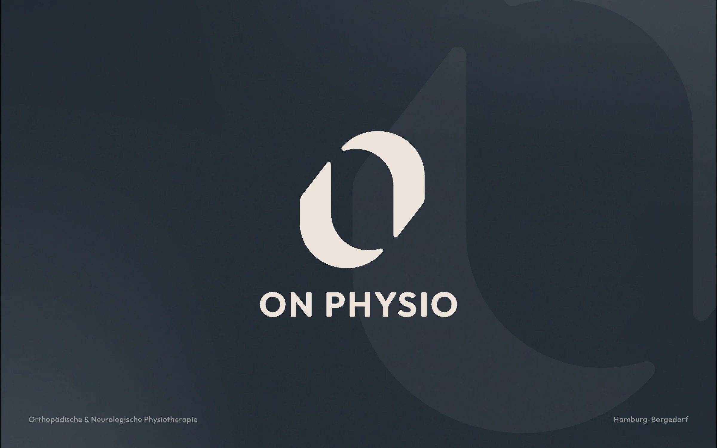
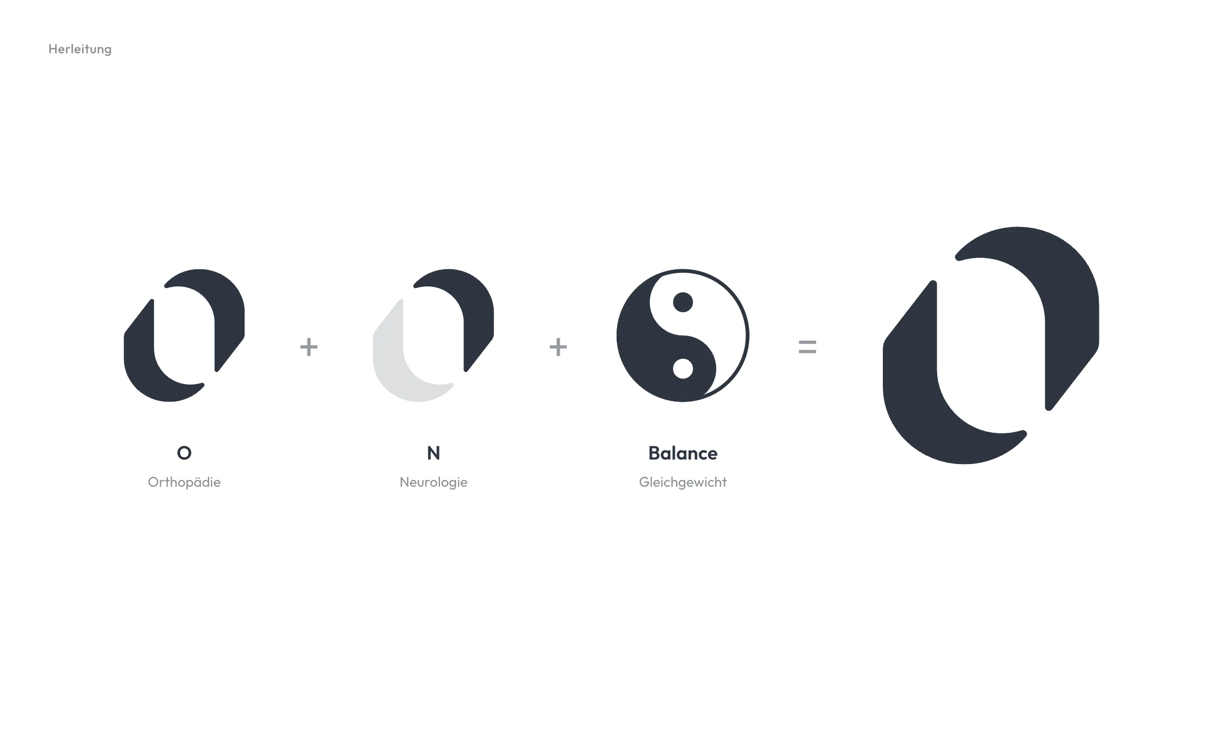
The name is already in the mark: O for orthopaedics, N for neurology. Two shapes interlock and keep each other in balance, just as body and nervous system work together in therapy.
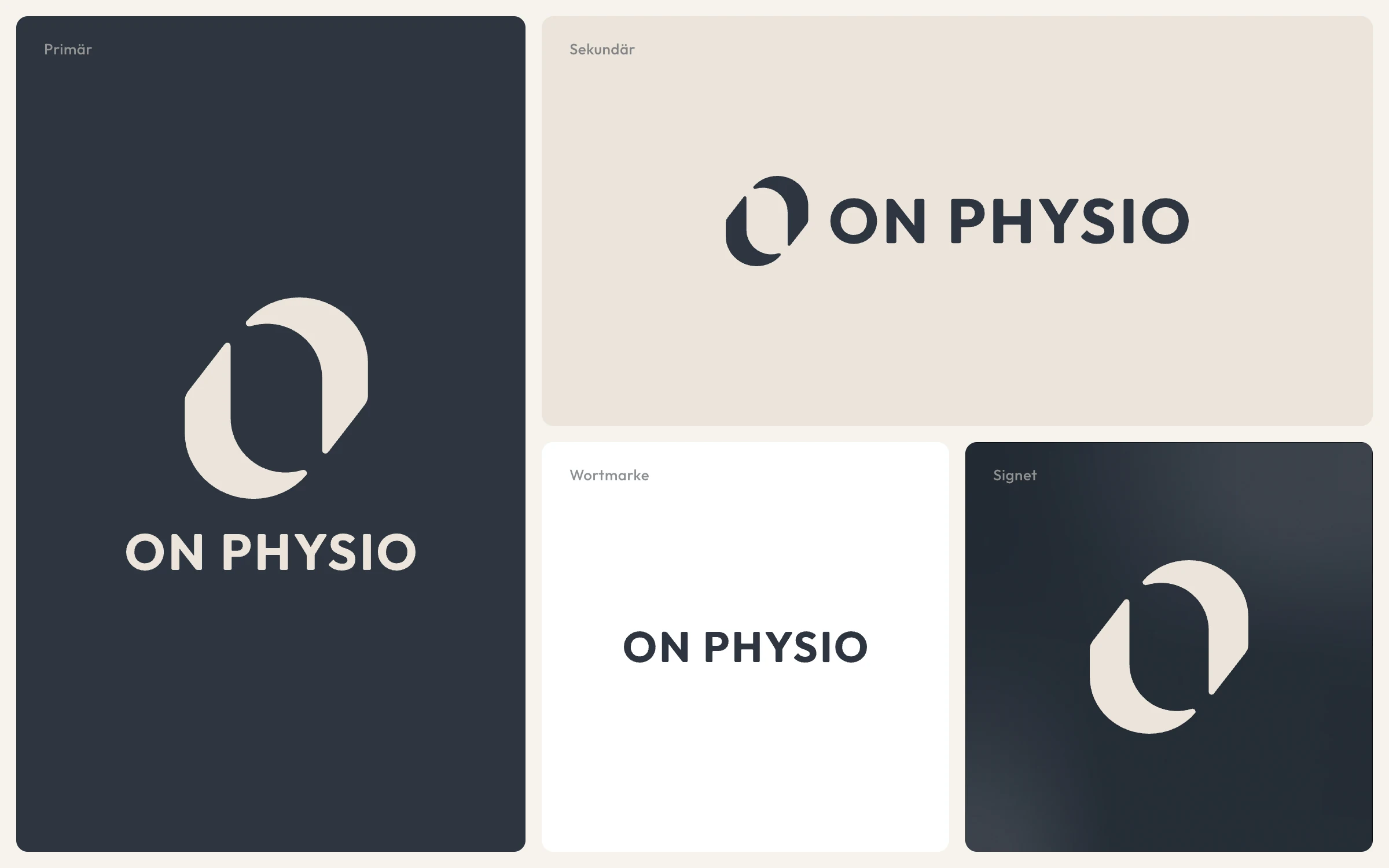
The signet works on its own, with the wordmark below or beside it, and stays recognisable at small sizes such as a favicon or profile picture.
Colour & Type
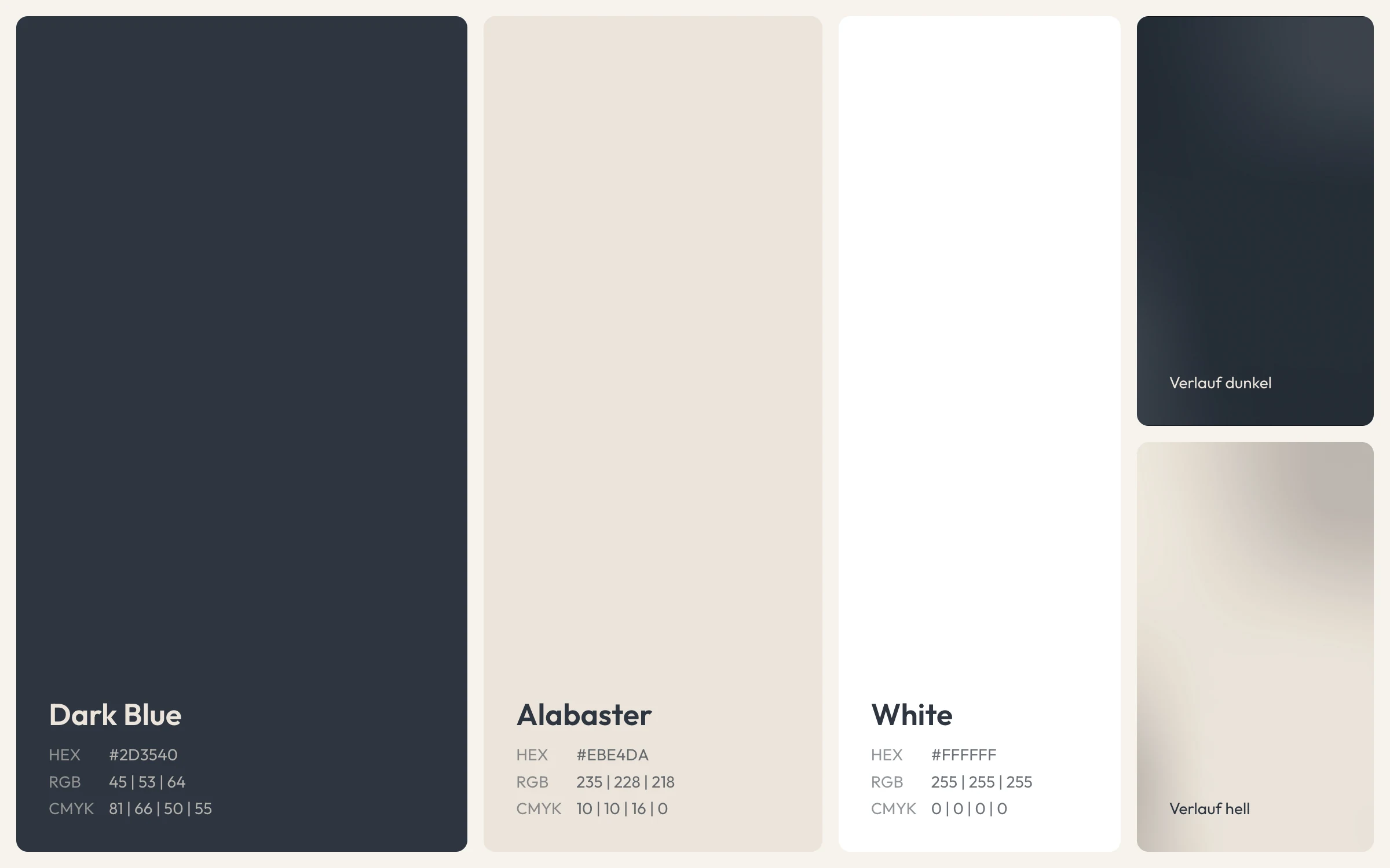
A deep dark blue and a warm alabaster instead of clinical white and signal colours: the palette is meant to convey calm and trust, while soft gradients add depth to large areas.
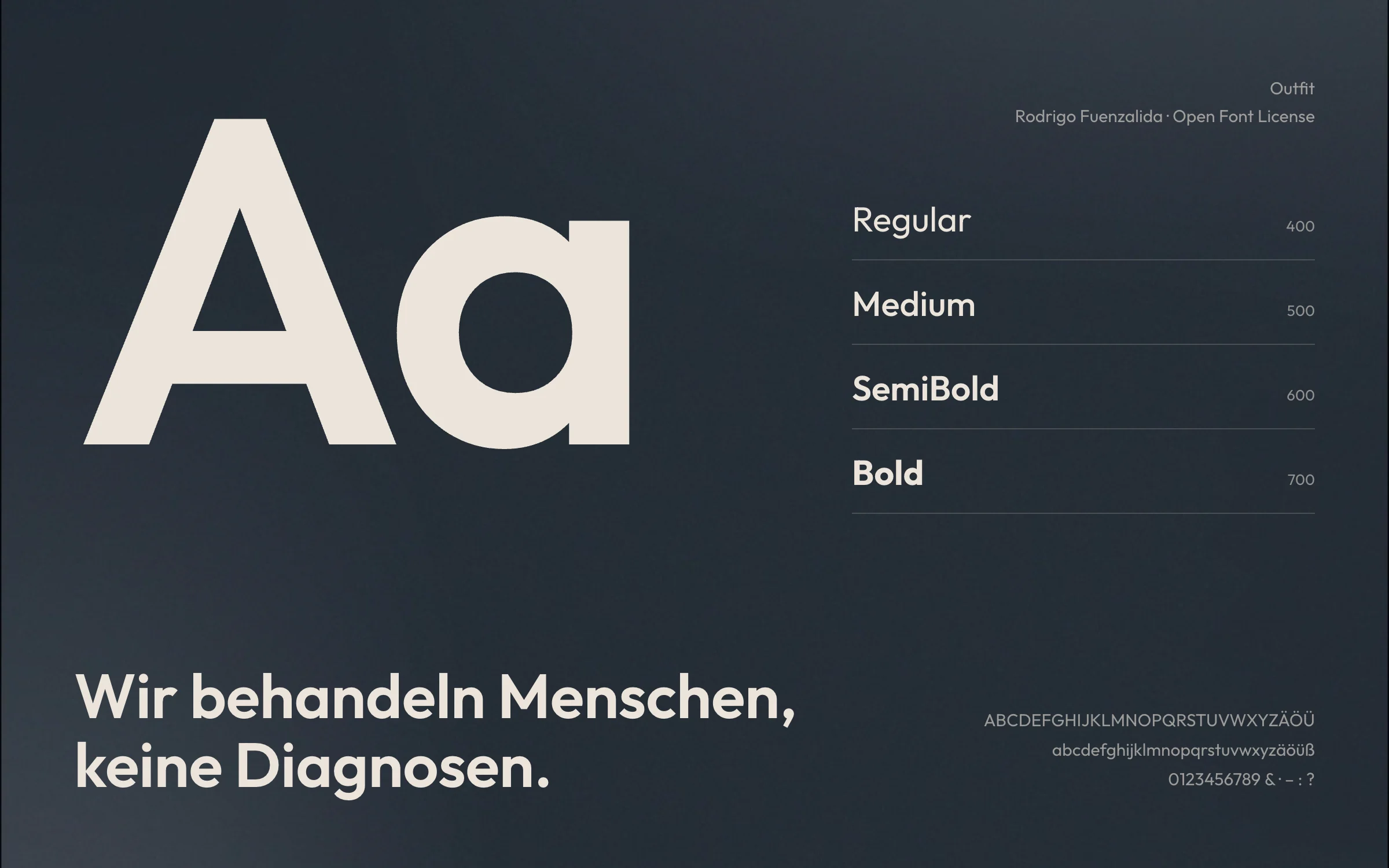
Outfit is used throughout: geometric, friendly and easy to read, from the door sign to the website.
On Site
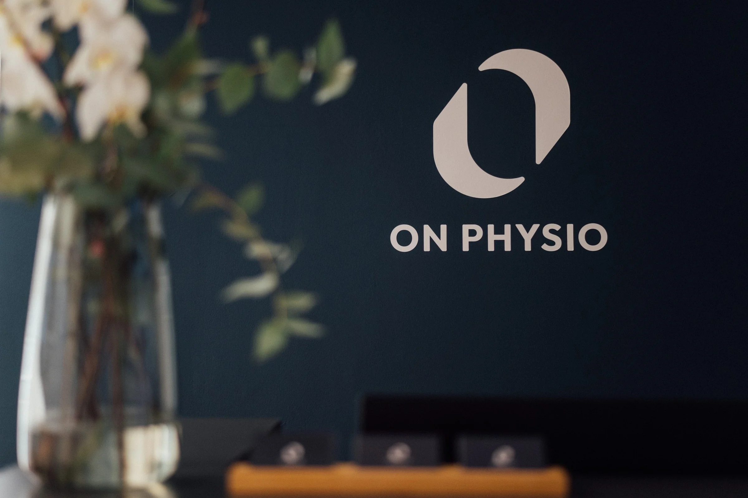
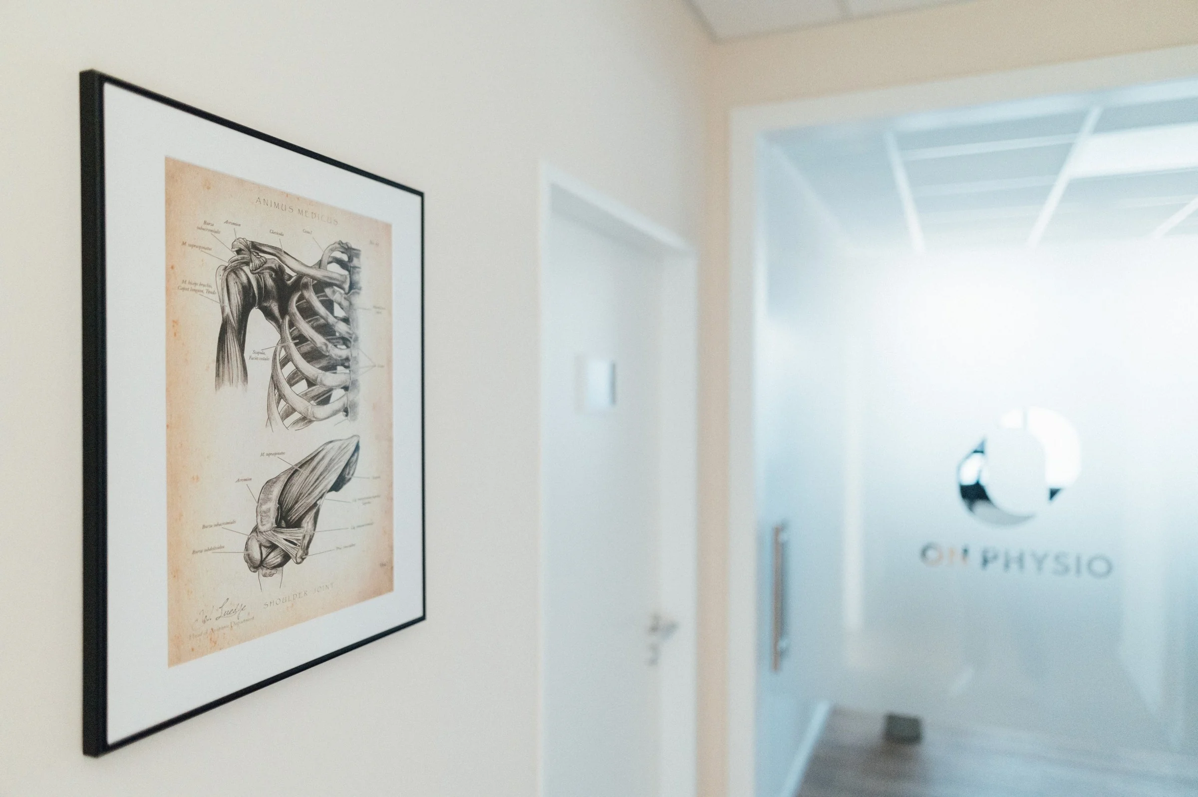
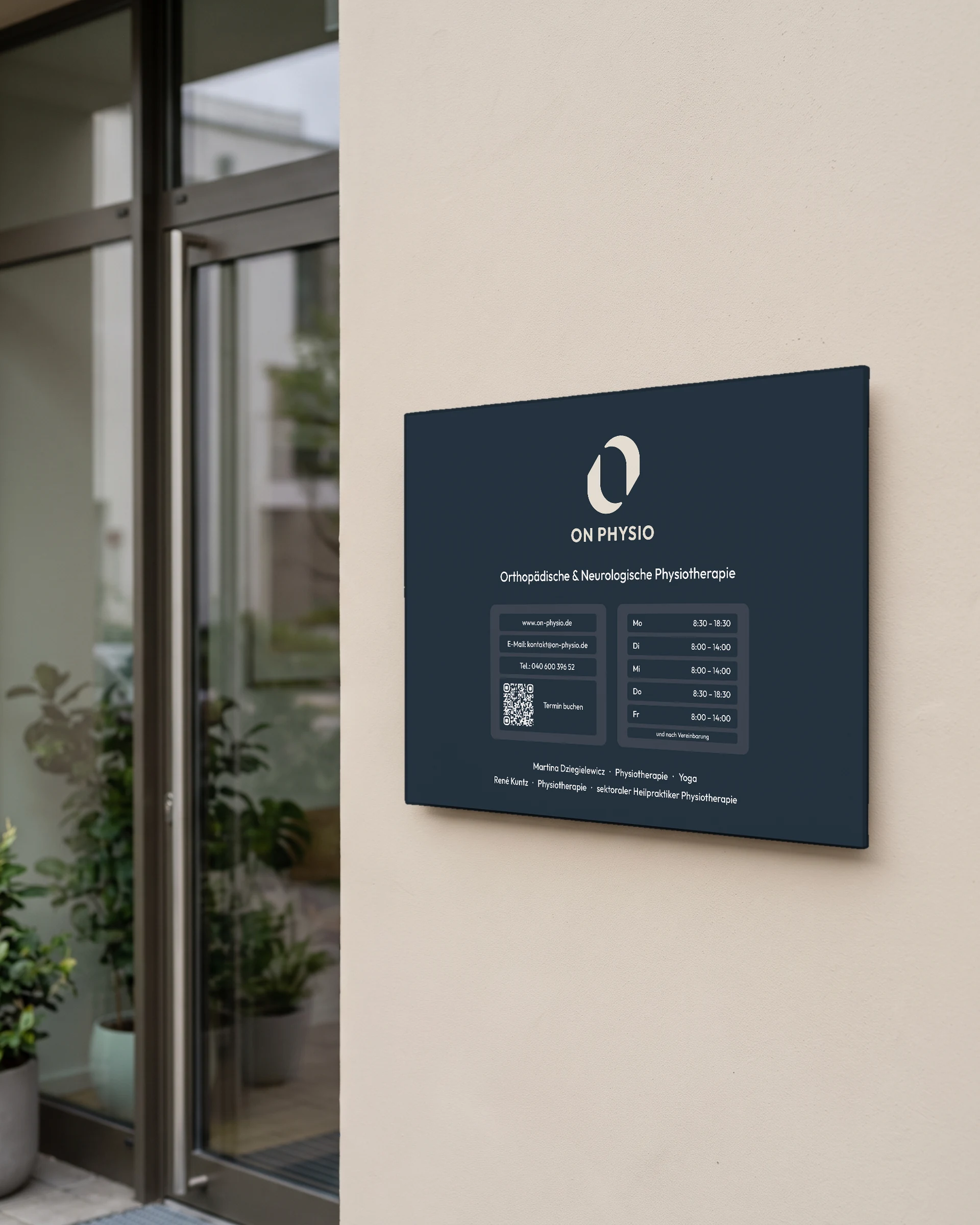
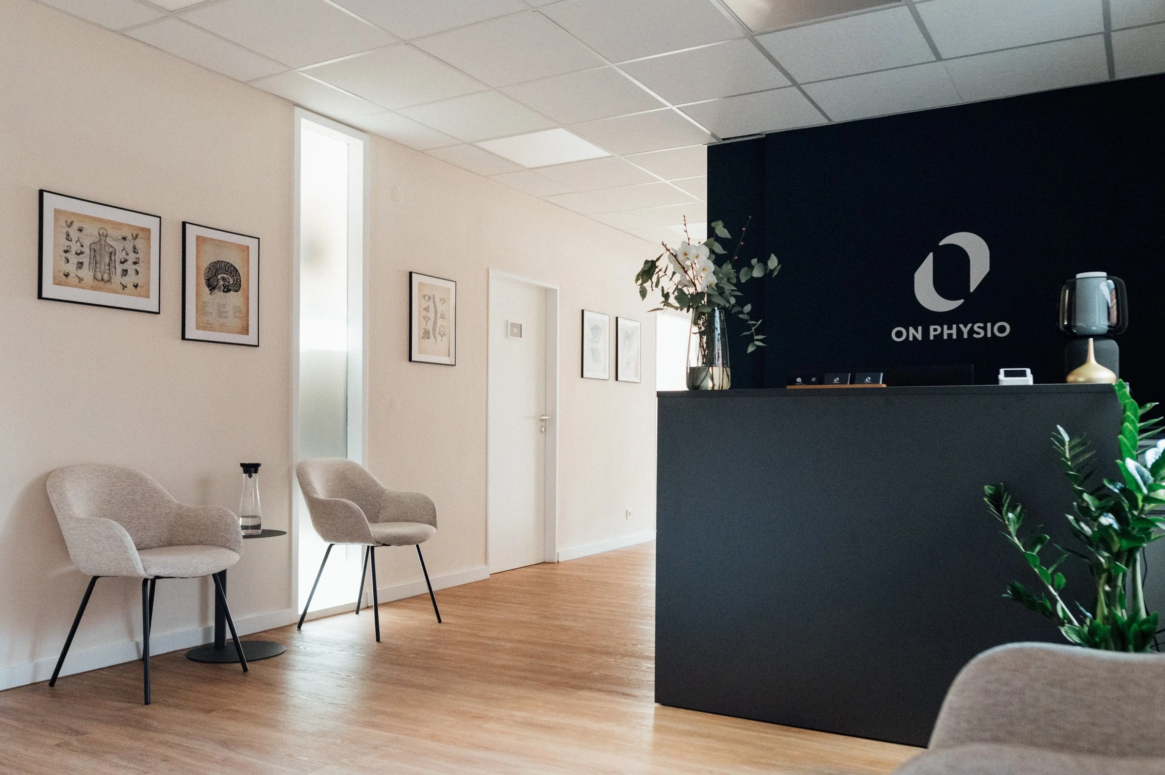
The brand shapes the rooms as well: the logo sits as cut vinyl on the wall behind the reception and on the glass door, and room signs with their own icons guide visitors through the practice.

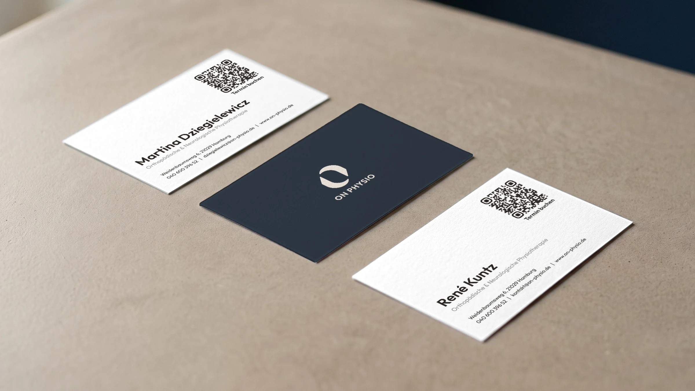
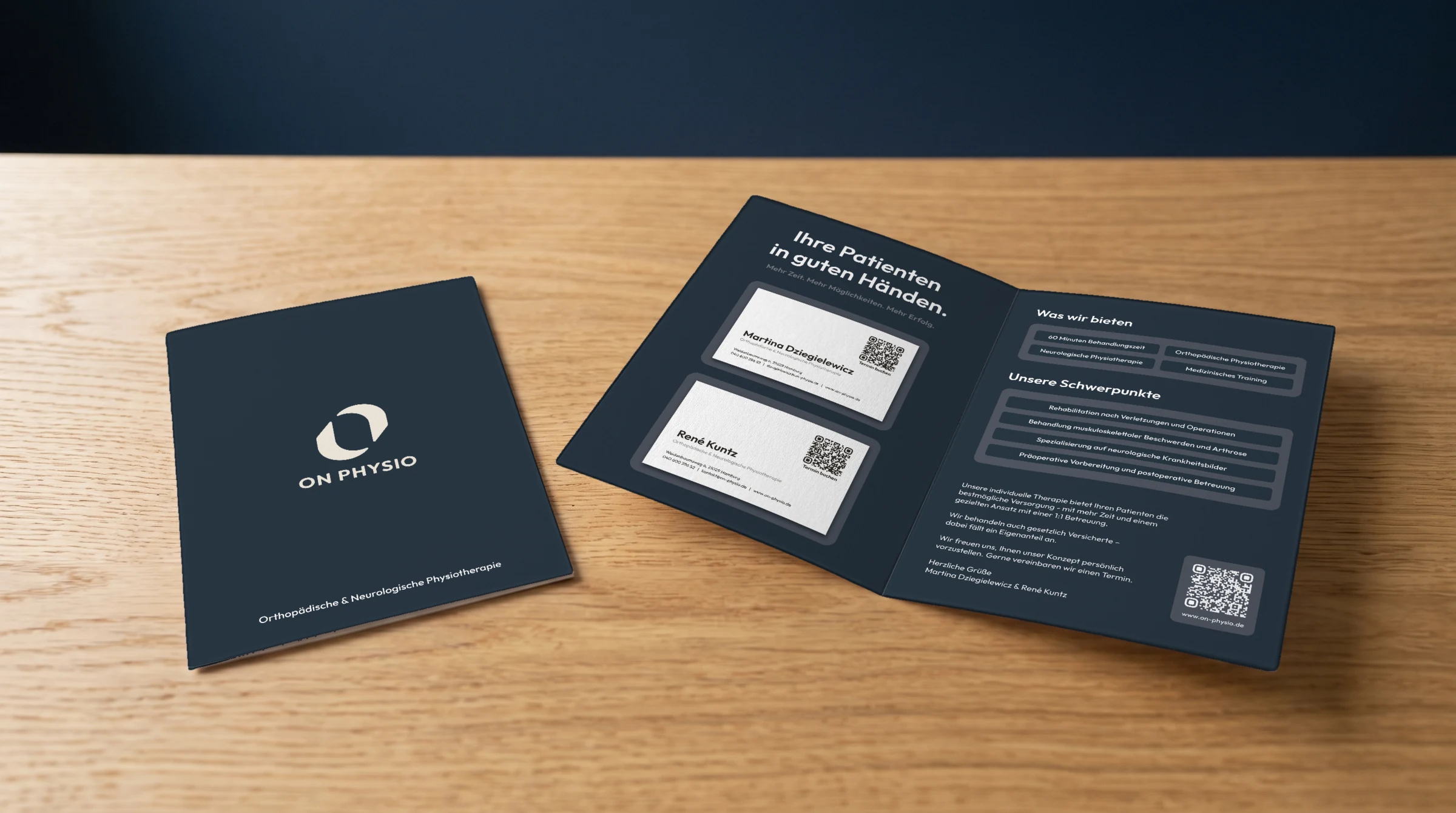
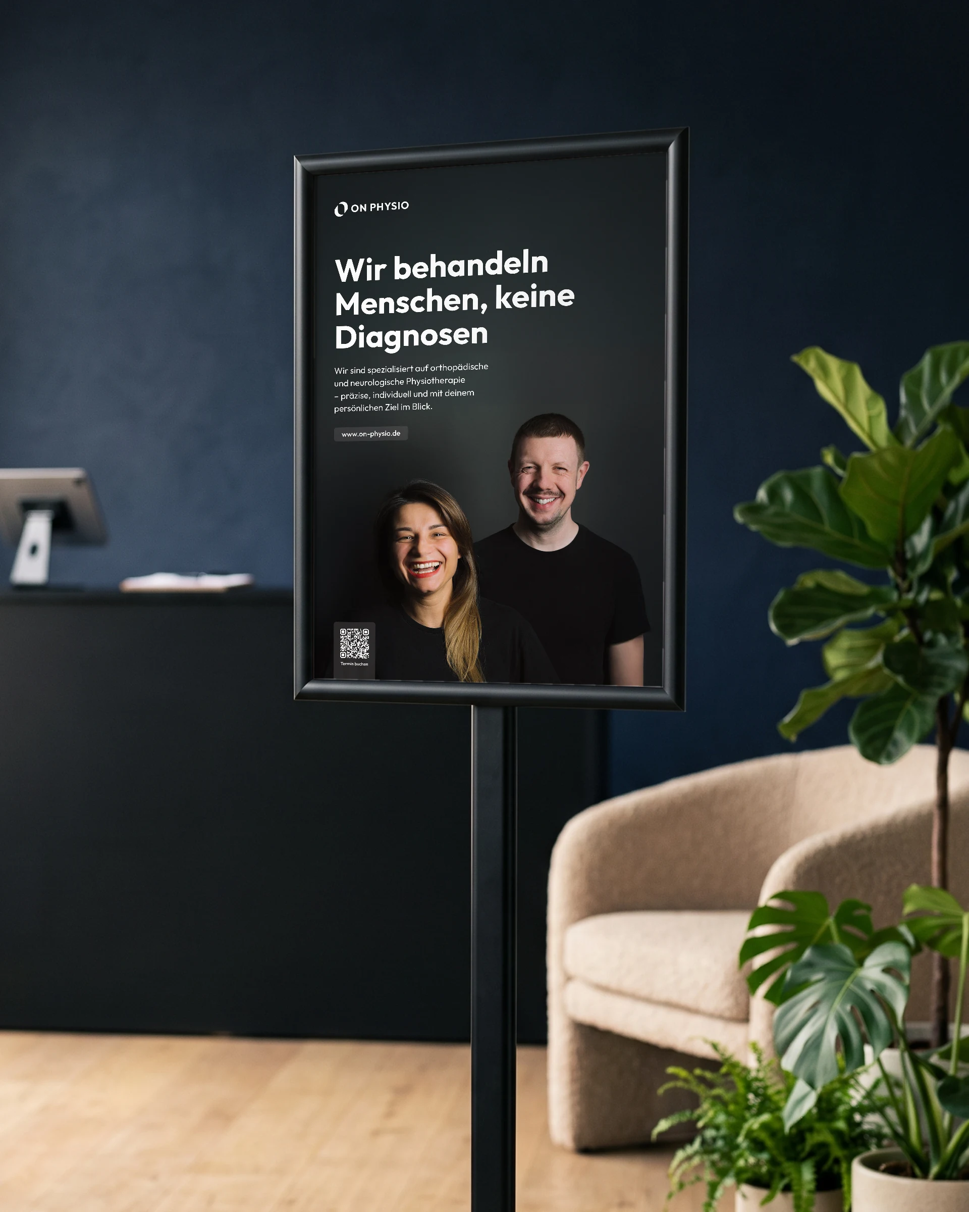
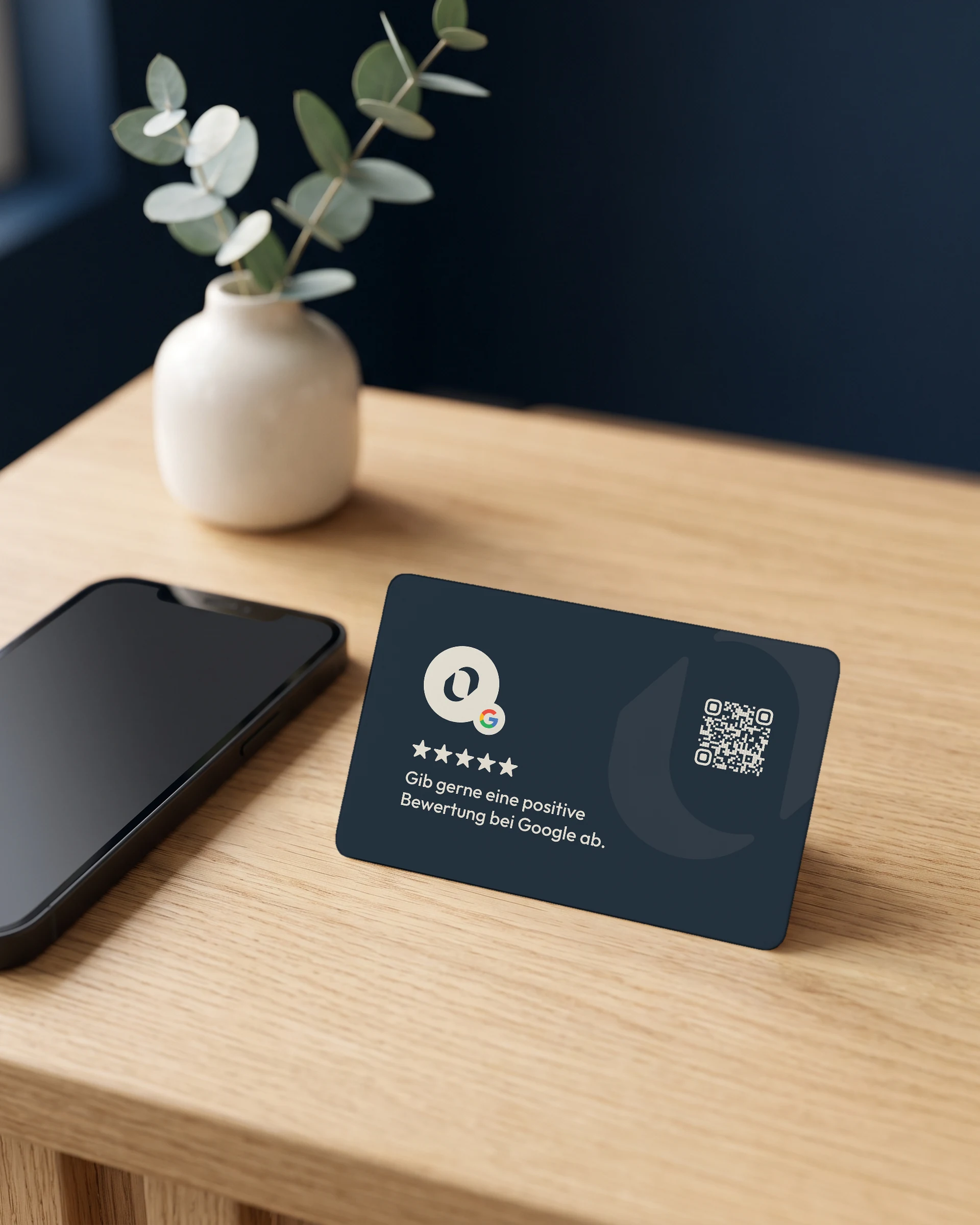
Business cards with a QR code for booking appointments, a folded card that introduces the practice to referring doctors, a poster, and an NFC card that opens the Google review page with a single tap.
Website
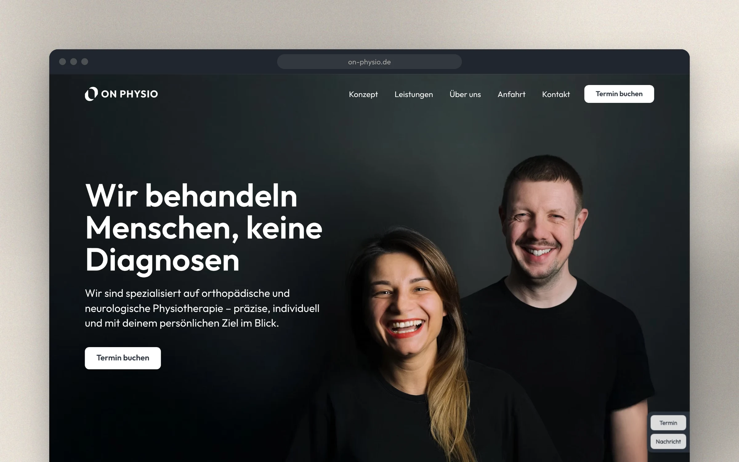
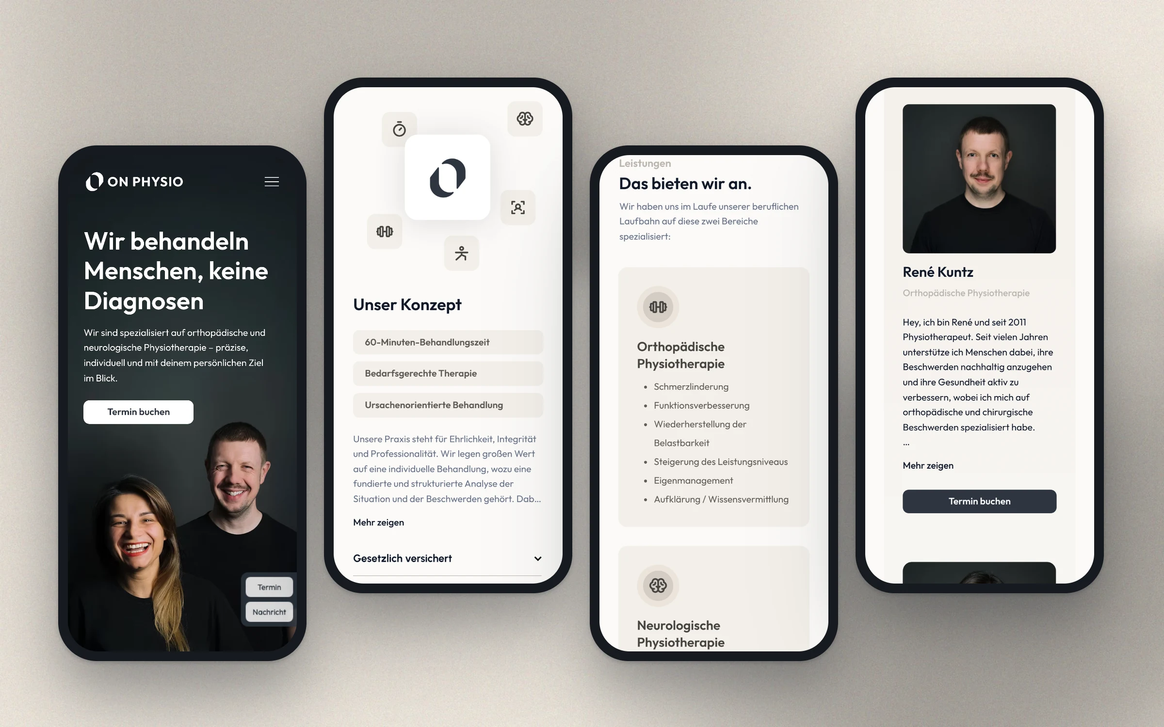
I designed the website and built it in Wix Studio. It centres on the two people behind the practice and their promise: 60 minutes for every appointment.
Services and specialisations are clearly structured, and appointments can be booked online right away.

Social Media
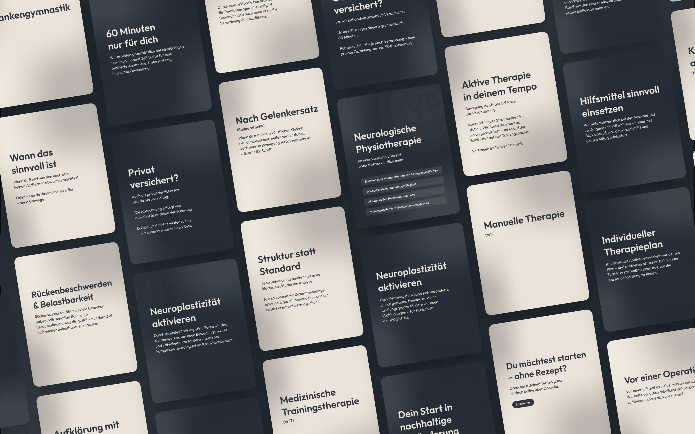
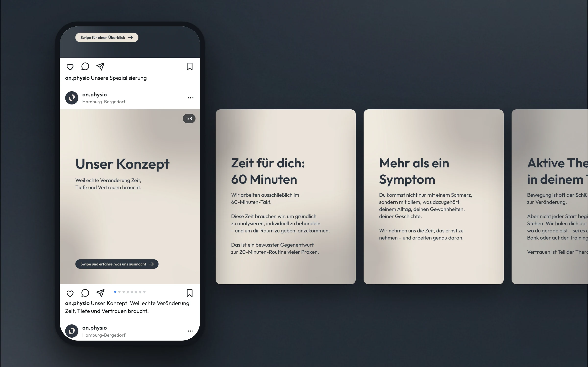
For Instagram I developed a carousel system: light and dark backgrounds, clear headlines, one thought per slide. It lets the practice explain services and processes without starting from scratch every time.