Quint
Brand Design, Print Design, 2024
Quint is a firm for tax advisory, auditing and business consulting with offices in Hamburg, Berlin and Scharbeutz.
I have been shaping the firm's appearance since it was founded in 2024: from the logo, colour palette and typography to the print materials and everything else that day-to-day business calls for.

Logo
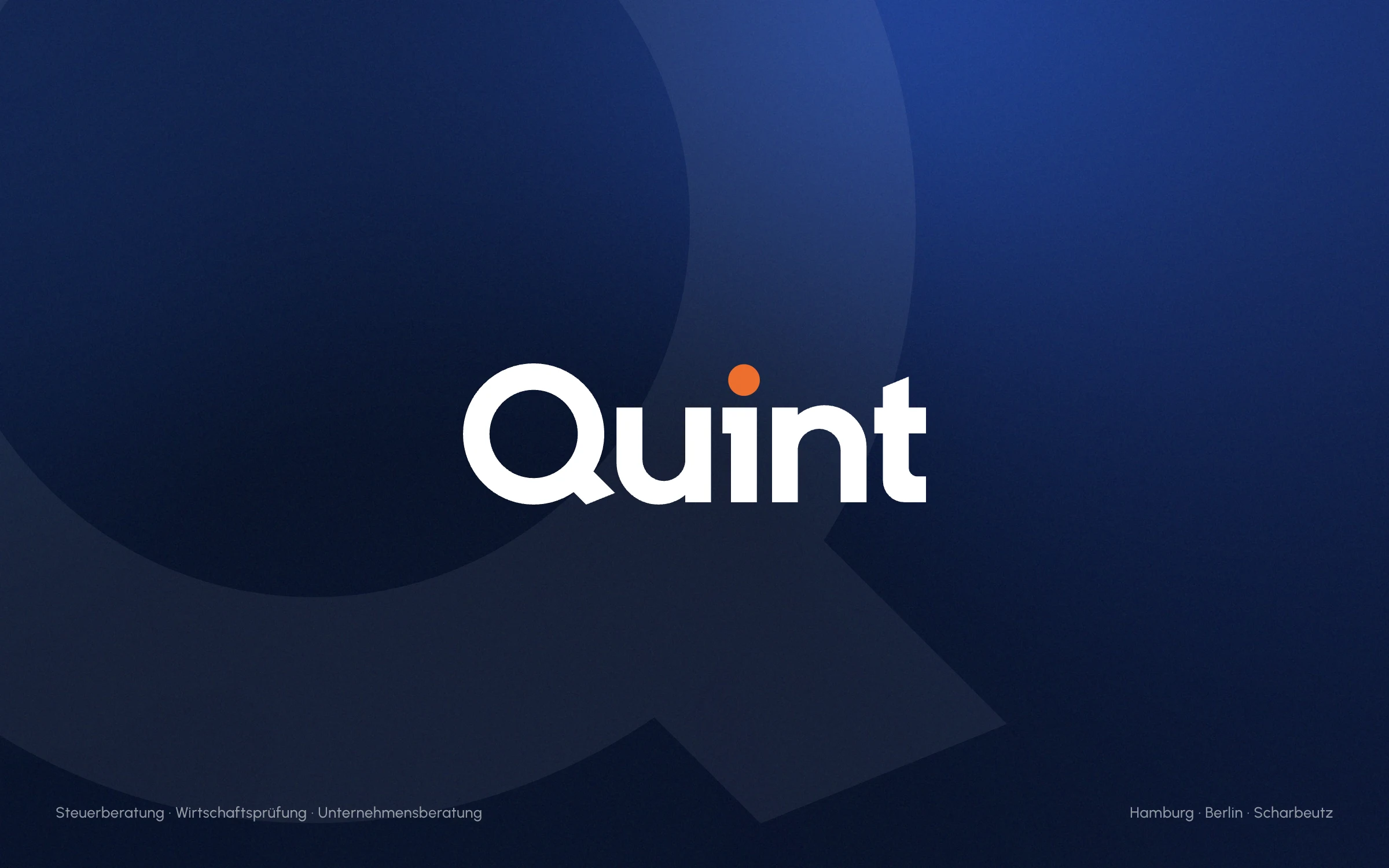
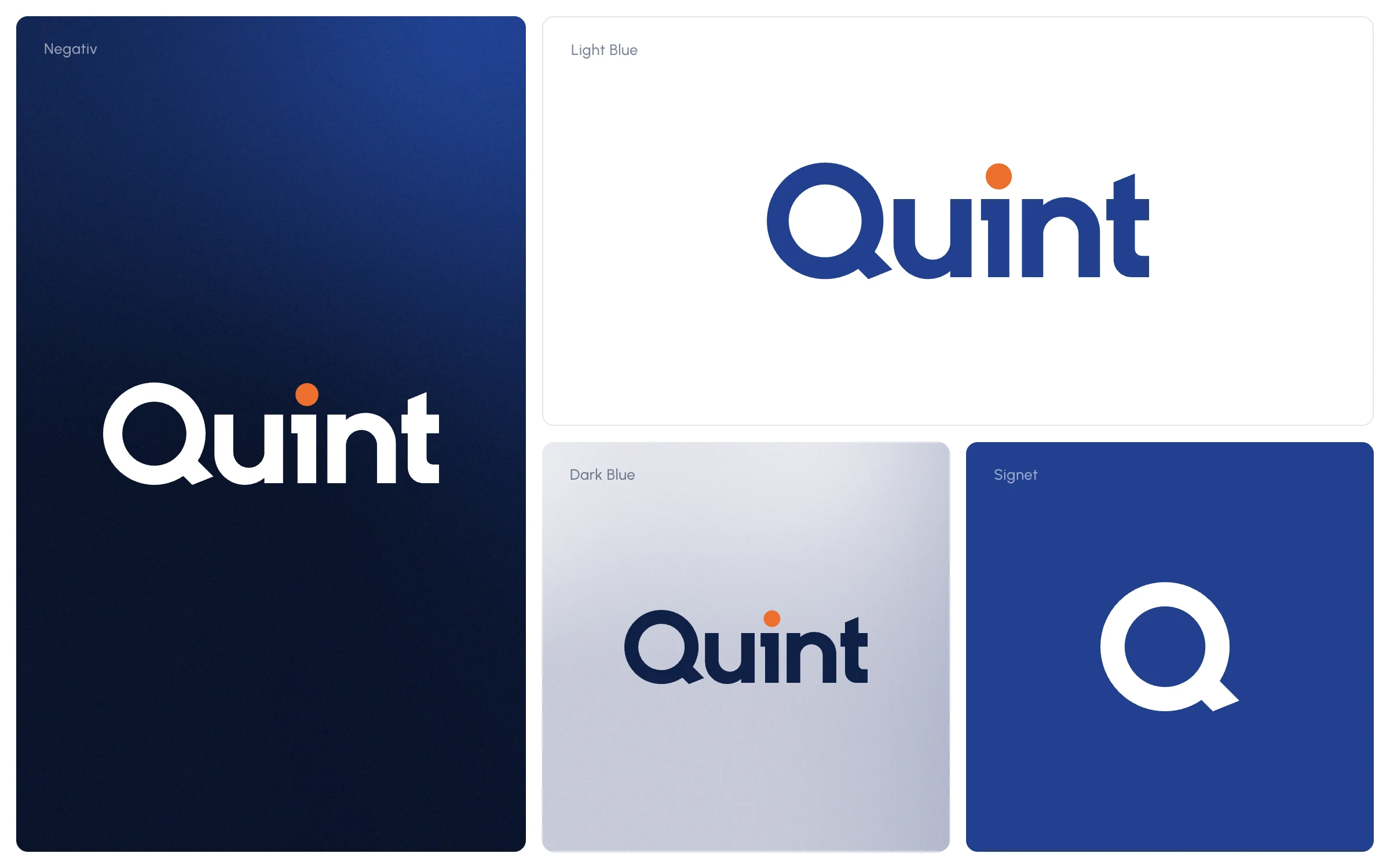
The wordmark is custom-drawn: geometric, bold, and with a Q whose tail breaks out of the circle. The orange dot on the i is the only accent, fitting for a firm that wants to get straight to the point.
The Q also works on its own as a signet and reappears, large and cropped, on cards, cover pages and backgrounds.
Colour & Type
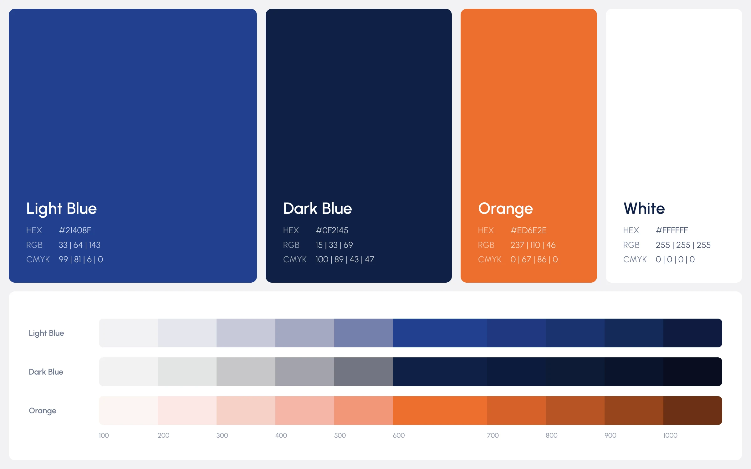
Two shades of blue carry the brand, with orange for accents. Each colour comes in ten steps; soft gradients and the Q as a relief add depth to large areas.
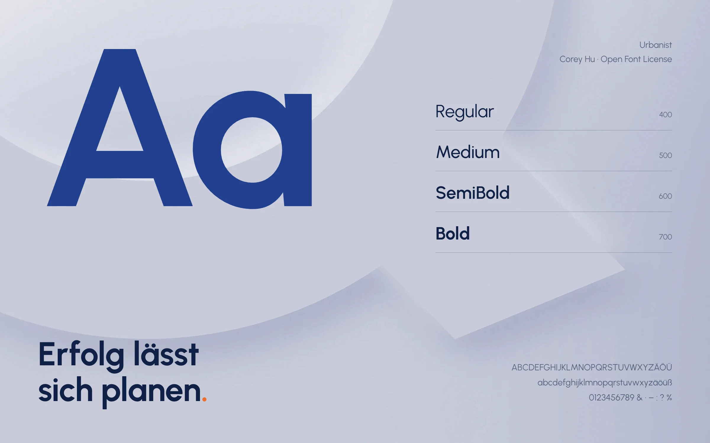
The typeface is Urbanist, geometric like the logo and easy to read, from the business card to the cover page.
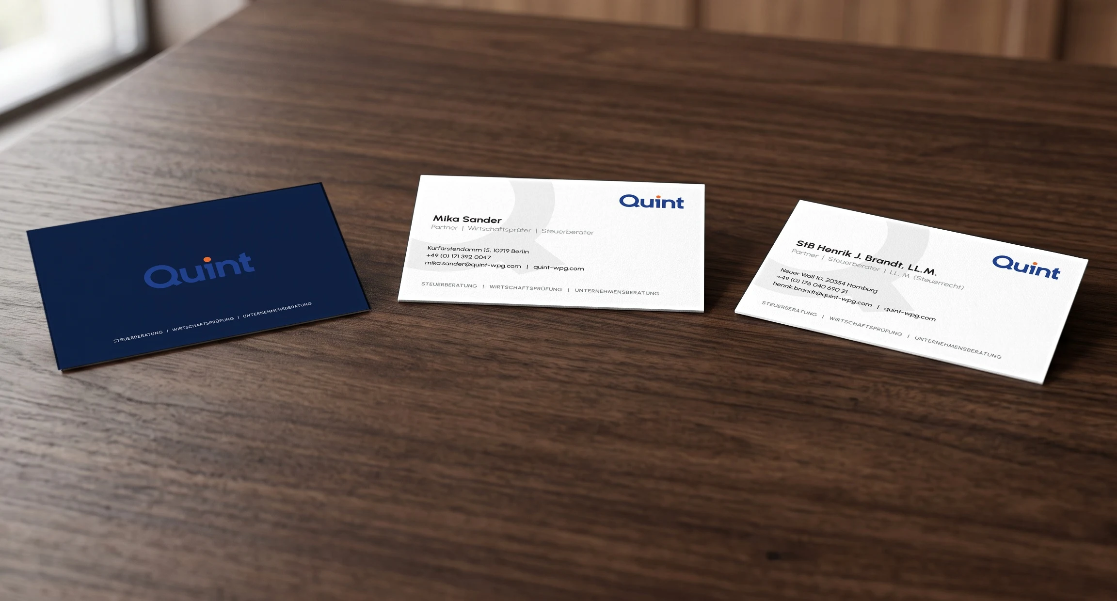
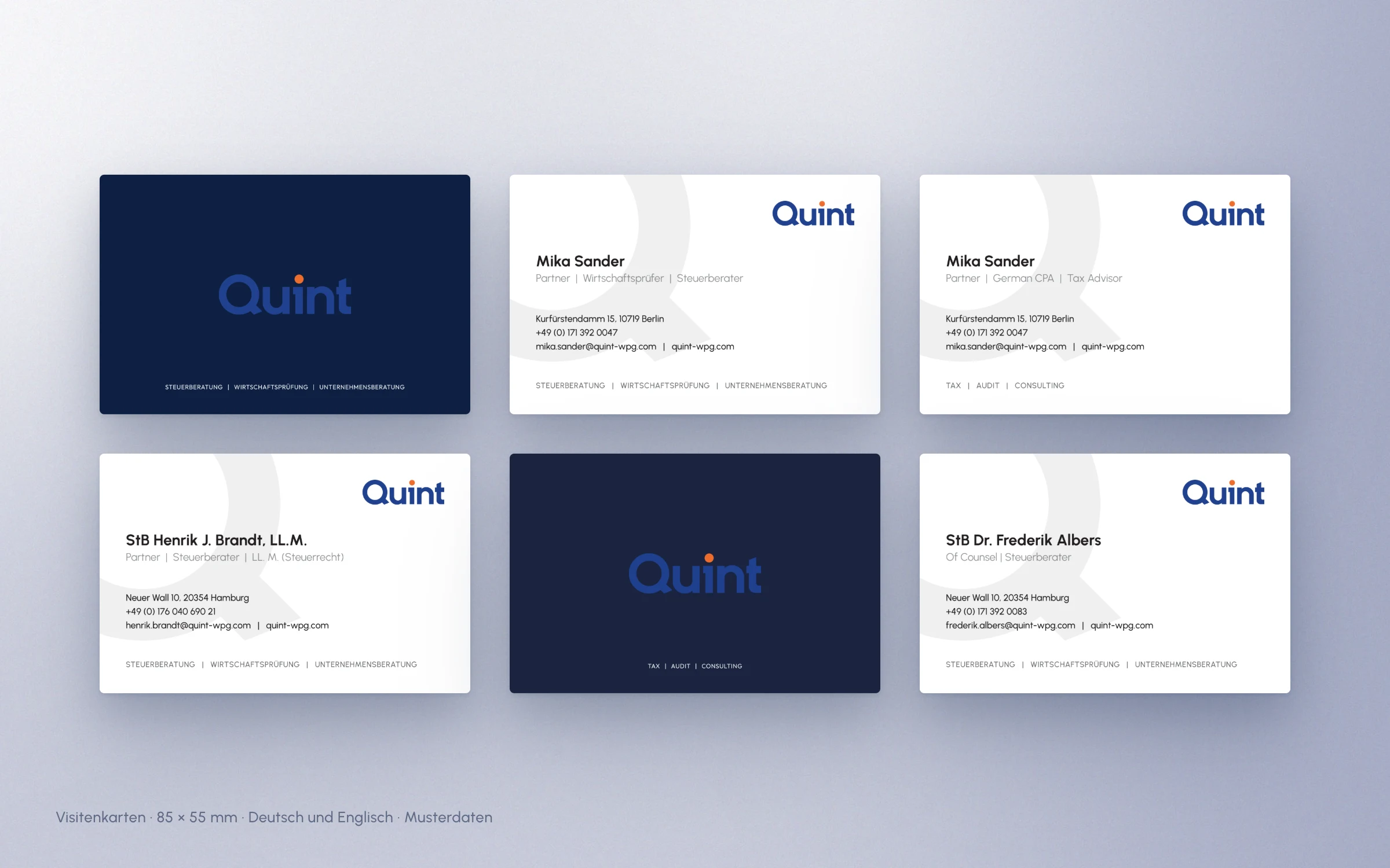
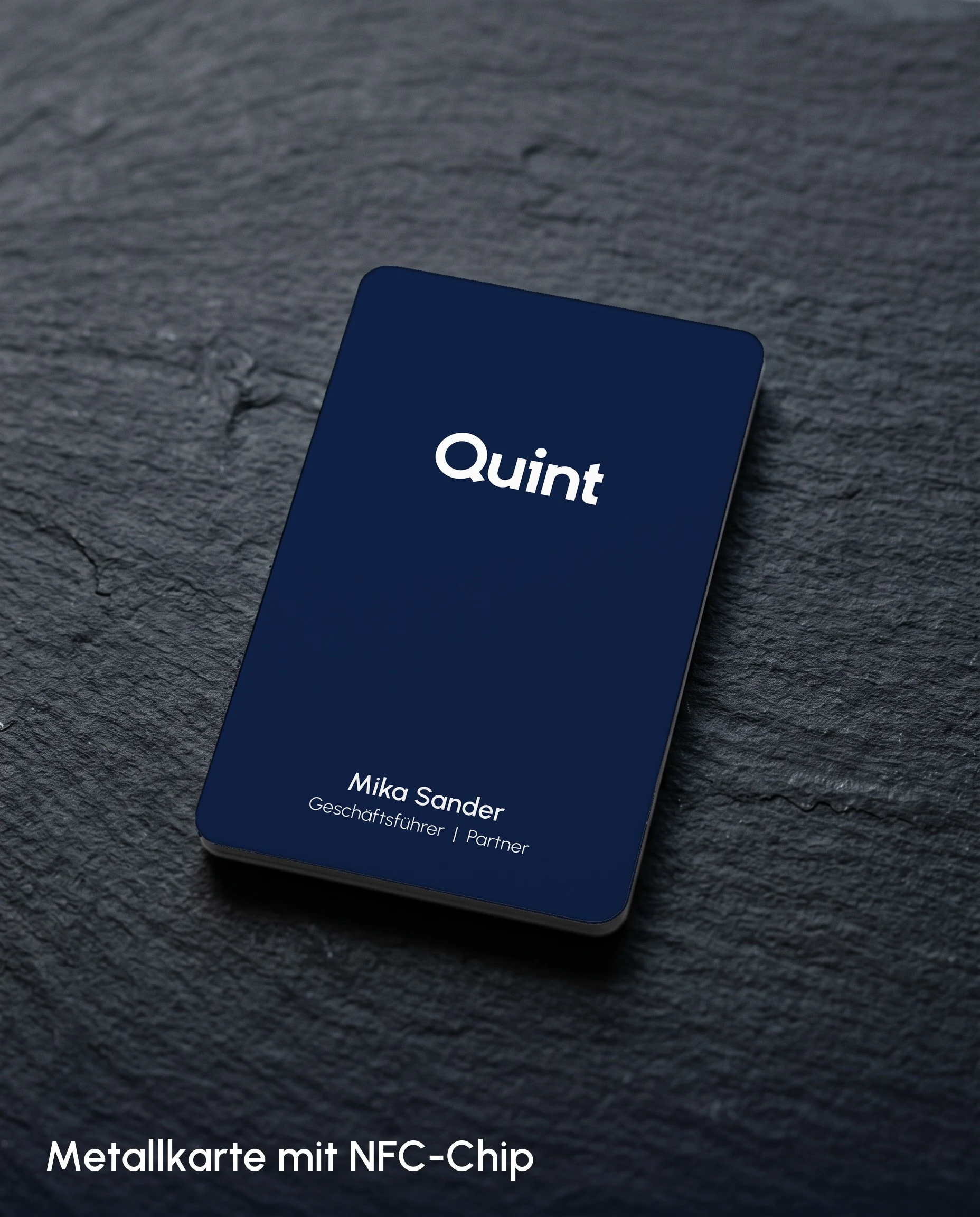
Business cards in German and English for three offices, plus a metal NFC card that transfers contact details to a smartphone with a single tap.
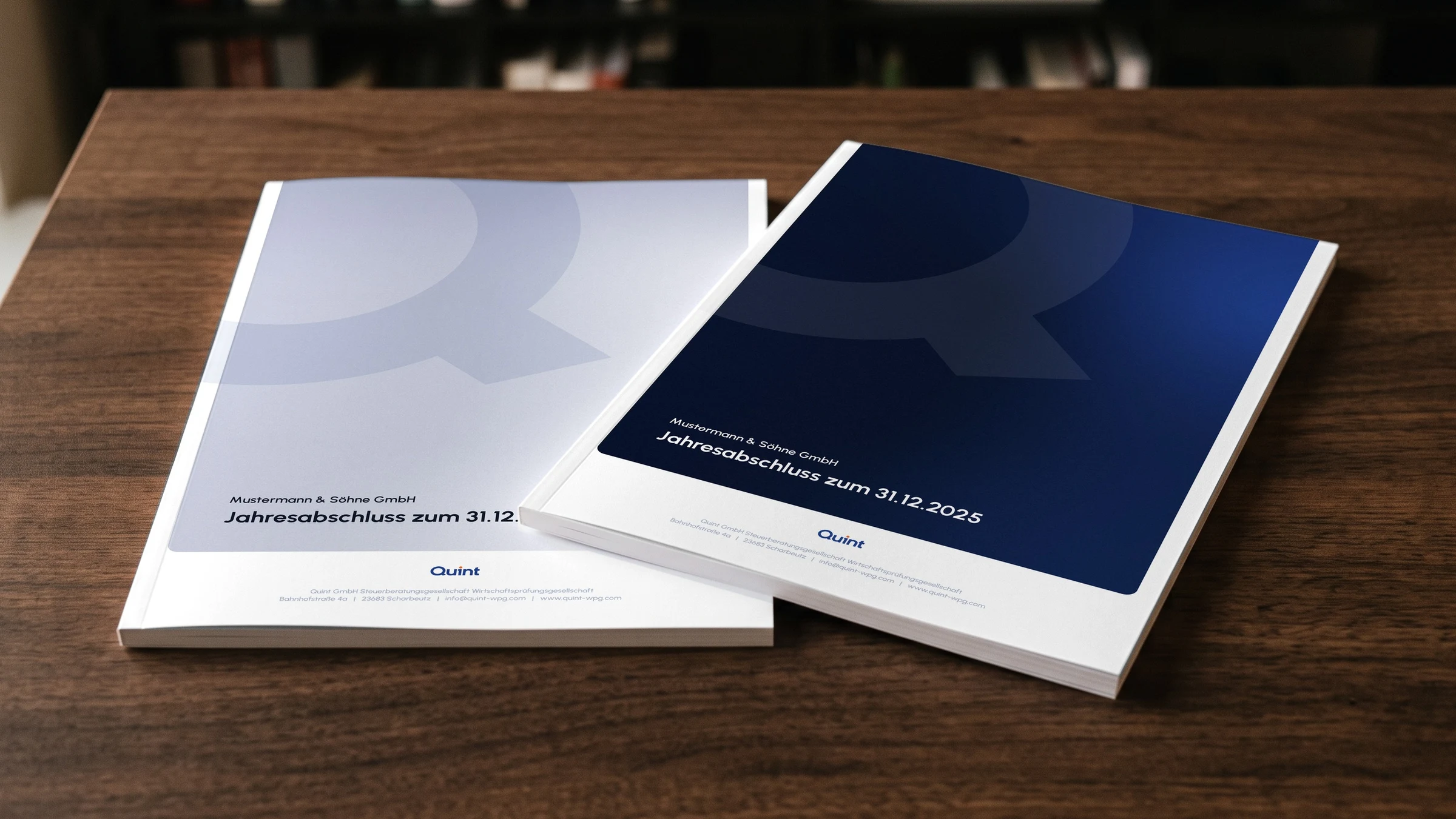
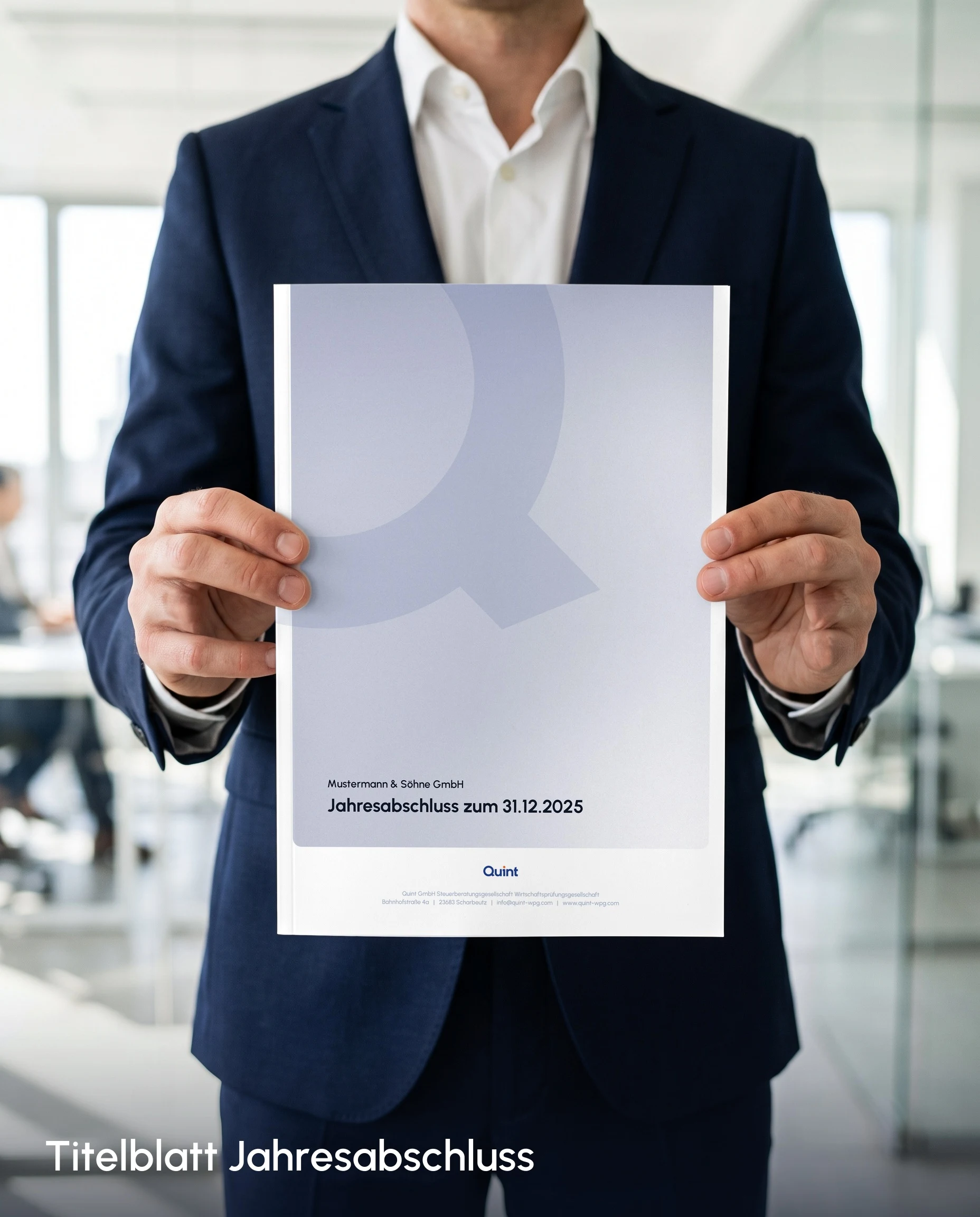
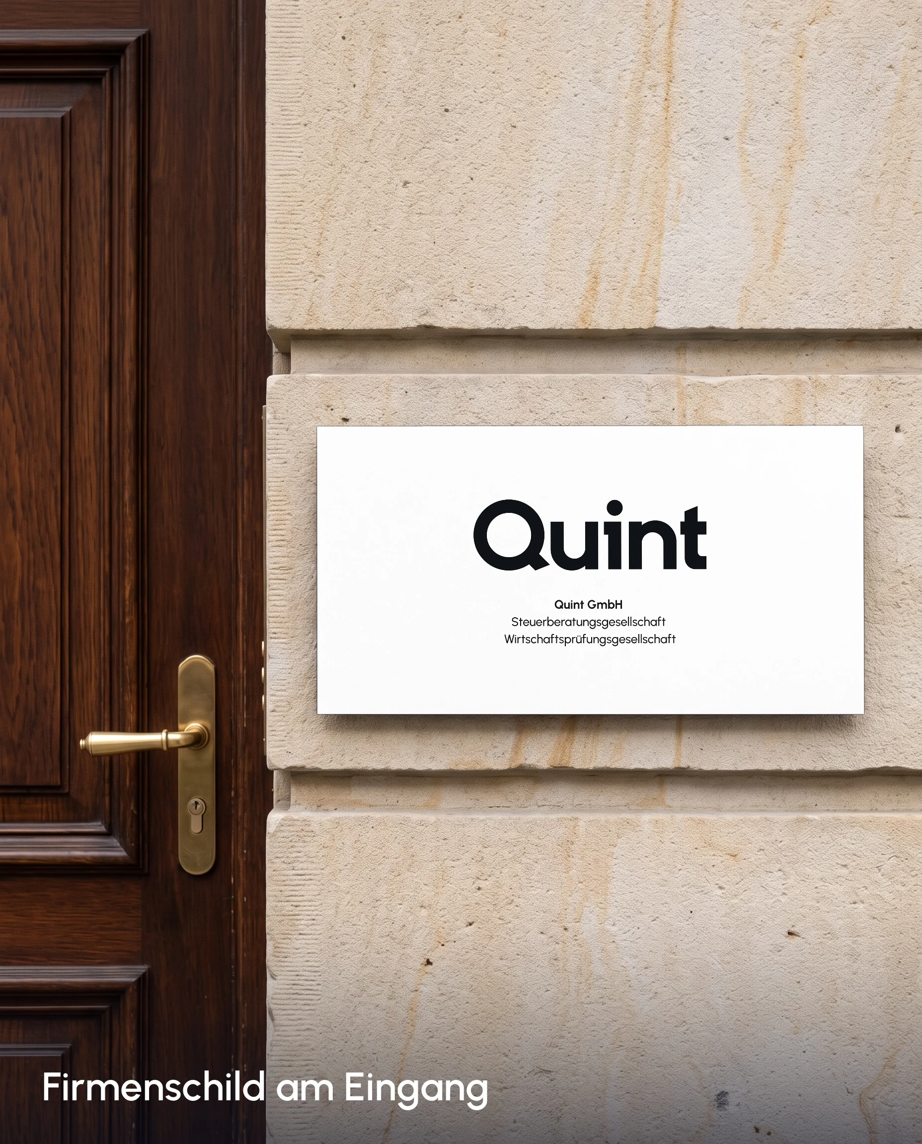
For client documents there is a cover page for annual financial statements in a light and a dark version, for the entrance a company sign, and even the employee benefit card carries the identity.

Everyday
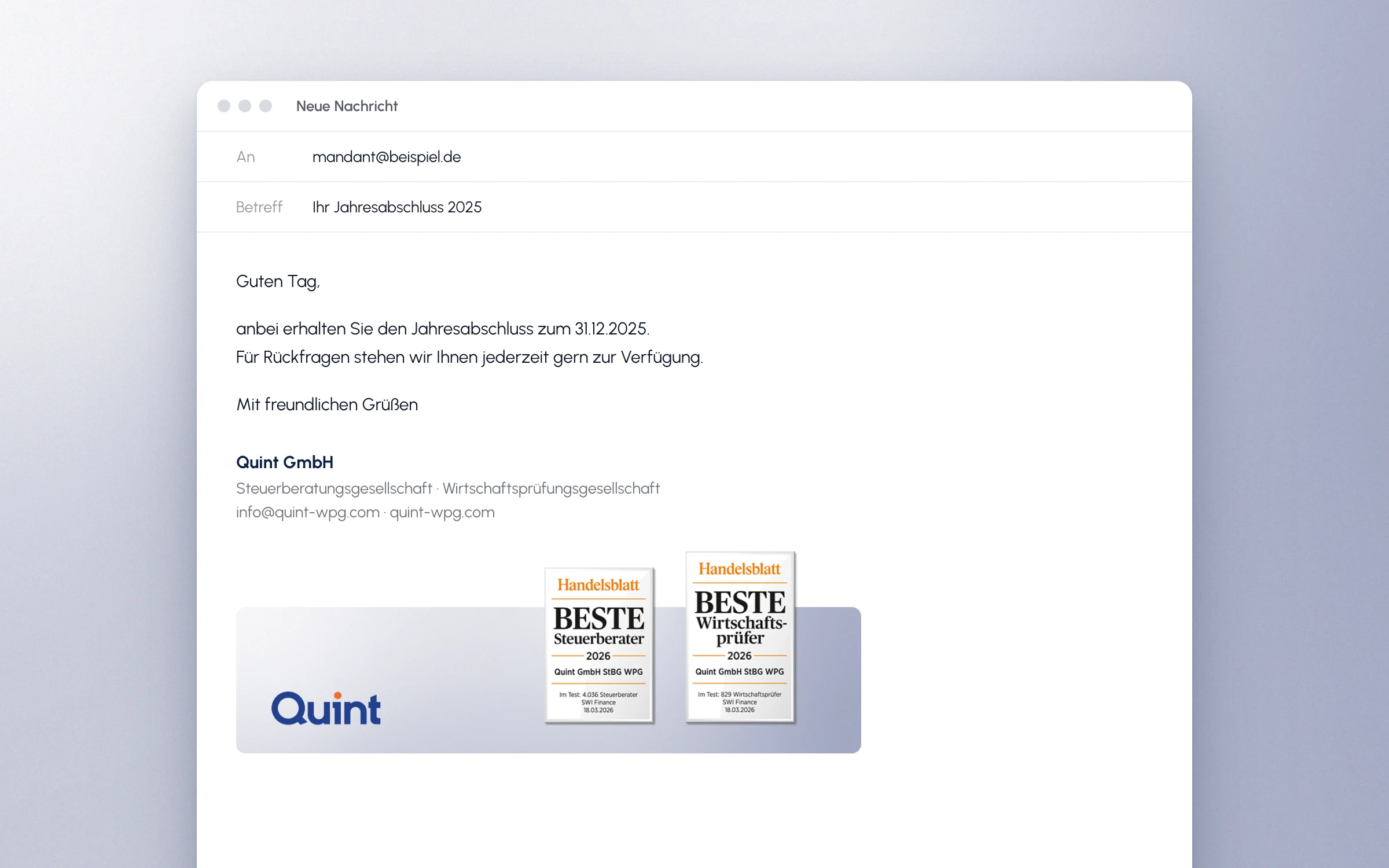
A brand has to work in day-to-day business, too. Among other things, this led to signature banners for e-mails, currently featuring the Handelsblatt awards. Graphics for LinkedIn complete the set.
Presentation
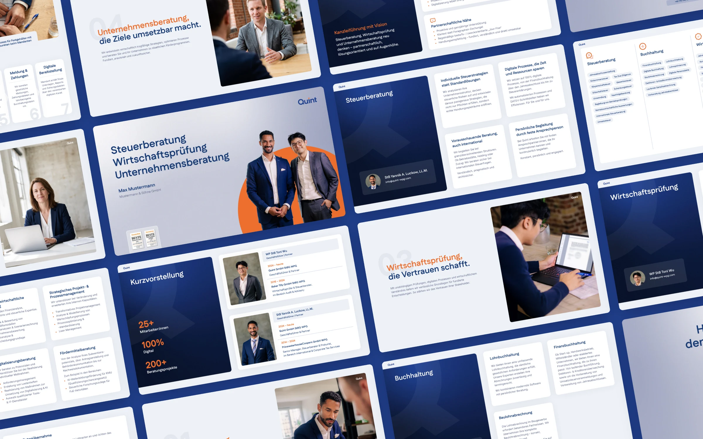
The firm introduces itself to new clients with a short deck in Google Slides: services, people and way of working on 15 slides. A grid of dark blue panels and white cards carries every kind of content, from chapter dividers to the monthly payroll process.
The deck is set up as a template: title, contact and closing slides exist in several versions that are shown or hidden depending on the meeting. For the portfolio, contact details have been replaced with placeholders and some portraits with AI-generated people.