Resilio
Brand Design, Print Design, 2026
Resilio Schadensanierung from Geesthacht near Hamburg restores buildings after water, fire and mould damage.
In 2026 I developed the company's visual identity from scratch: logo, colour palette, typography, icons and a brand pattern of its own, documented in brand guidelines and applied to the first pieces of stationery.
The Brief
Damage to your home is an exceptional situation. Anyone looking for help in that moment wants one thing above all: someone they can trust straight away.
So the brand had to convey calm and competence: clear, uncluttered and understood at first glance, from the business card to the vehicle.
The Idea
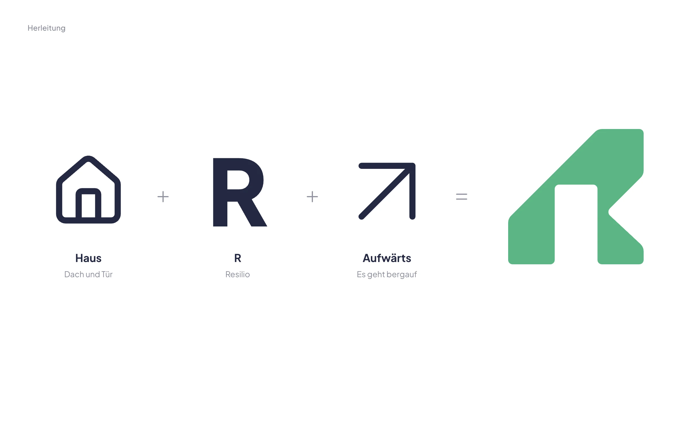
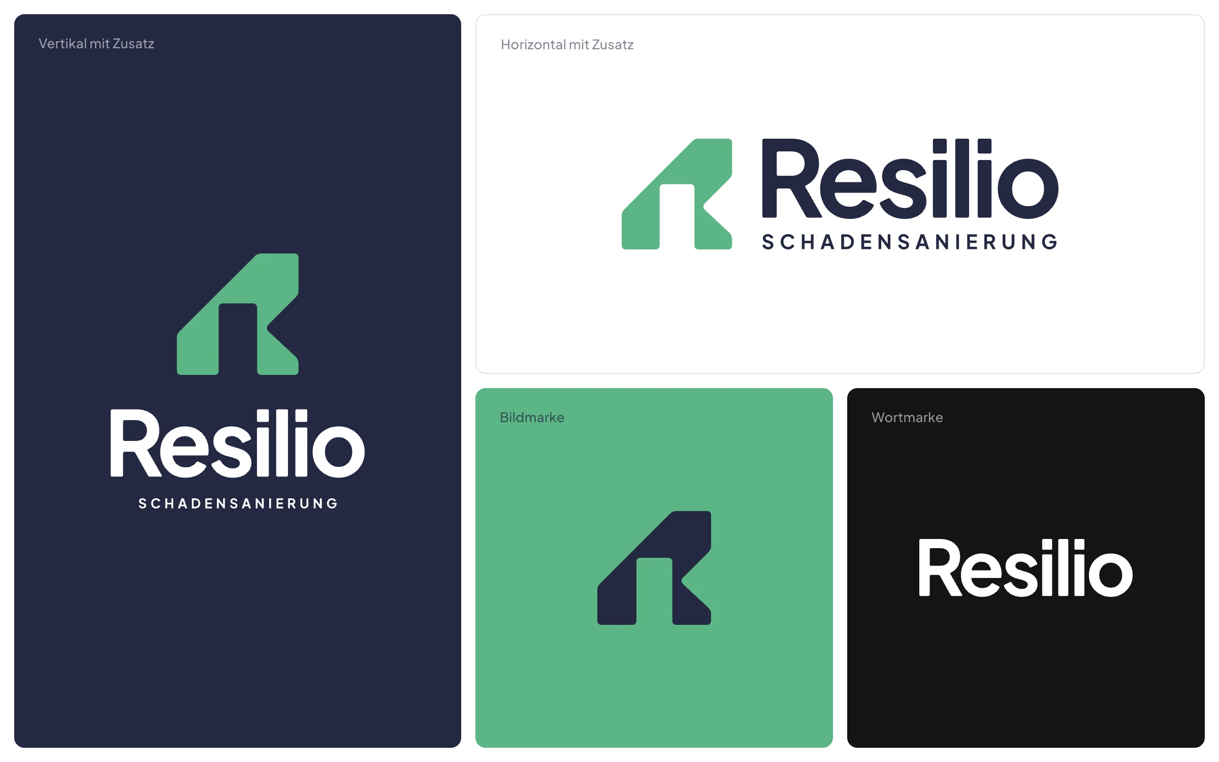
The logo mark combines three things in a single shape: a house with a door, the initial R and a roof line pointing upwards at 45 degrees.
After the damage, things are looking up again. The mark says so without needing an explanation.
Logo System
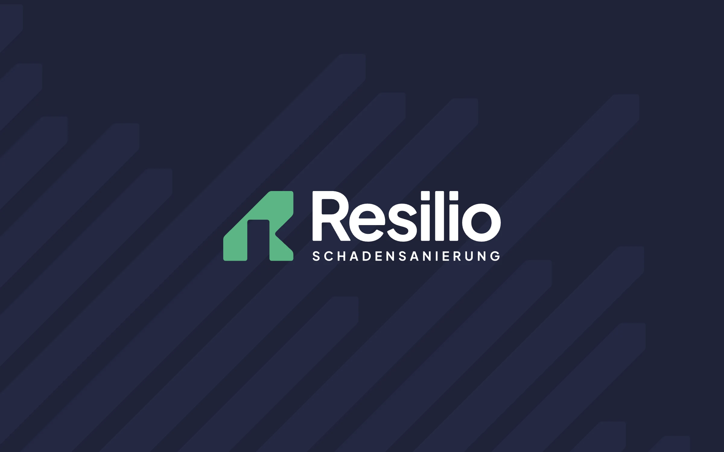
The logo consists of the mark, the wordmark and the descriptor “Schadensanierung” (damage restoration). The wordmark is based on Plus Jakarta Sans ExtraBold and individually refined.
There is a suitable version for every format: horizontal or vertical, with or without the descriptor, plus wordmark and mark on their own, for profile pictures, stamps or embossing, for example.
Colour & Type
Resilio Green and Resilio Navy carry the brand, joined by white and a deep black. Navy is for text and large areas, green sets the accents, in a ratio of 60 / 30 / 10. Each colour comes in nine steps.
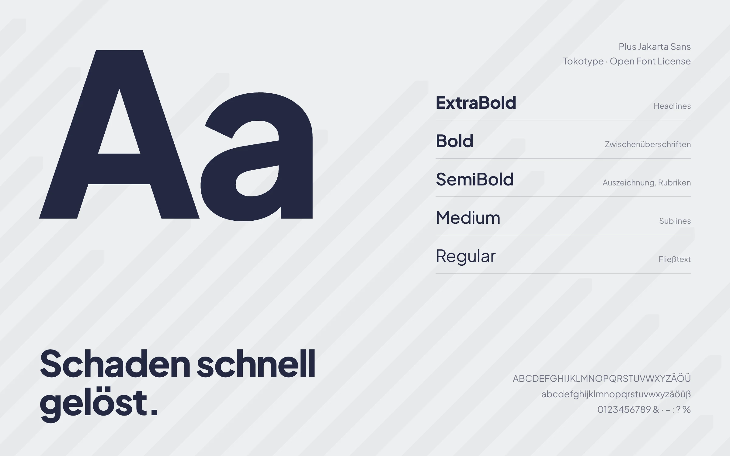
The typeface is Plus Jakarta Sans: a geometric grotesque that stays legible at small sizes and looks calm and matter-of-fact at large ones. It is freely available and can therefore be used everywhere, from quotes to the website.

Icons
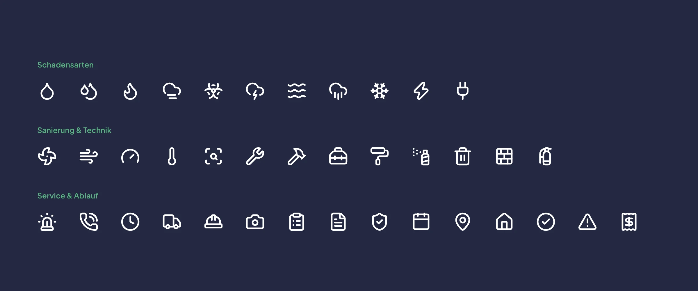
For types of damage, technology and process I defined an icon set: 39 motifs from the open-source library Lucide, from water damage and structural drying to emergency service and final inspection.
All icons share the same stroke weight and come in navy, white and green. If a motif is missing, it can be added in the same style.
Brand Pattern
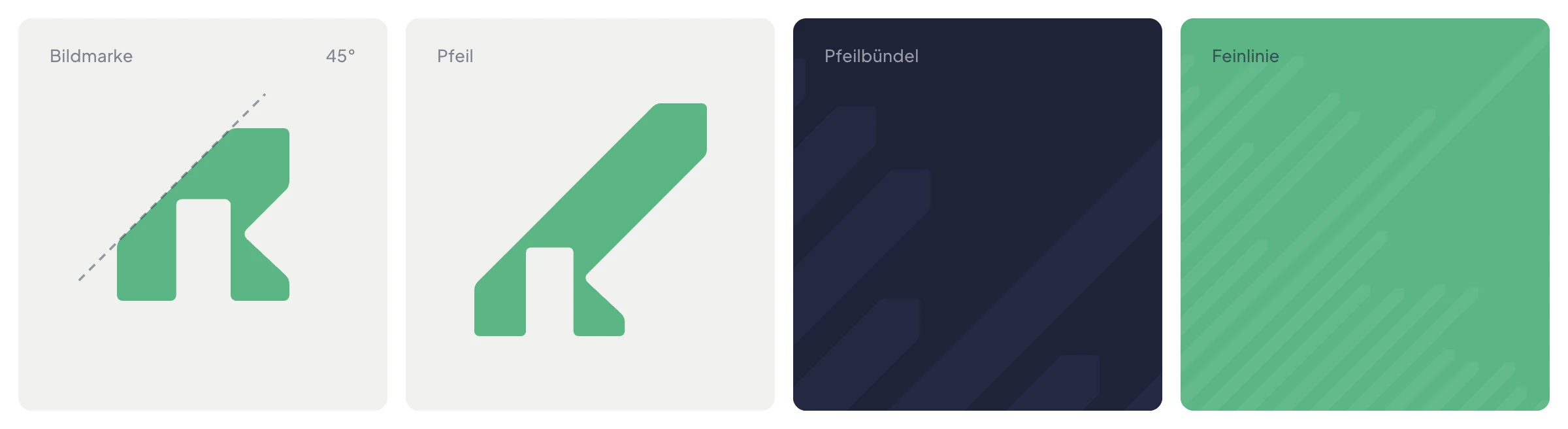
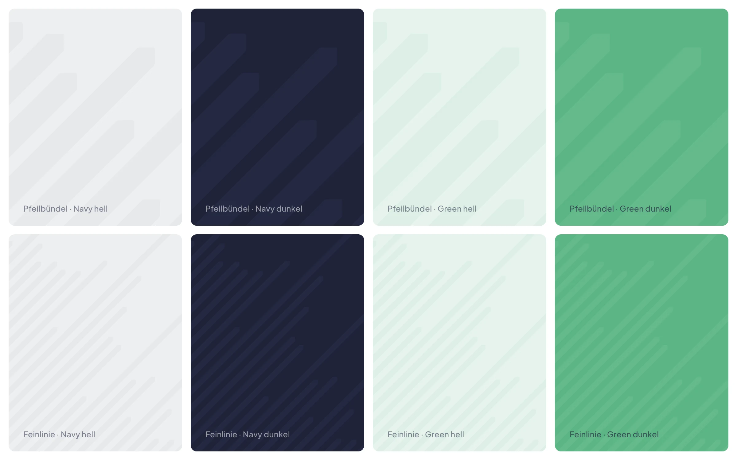
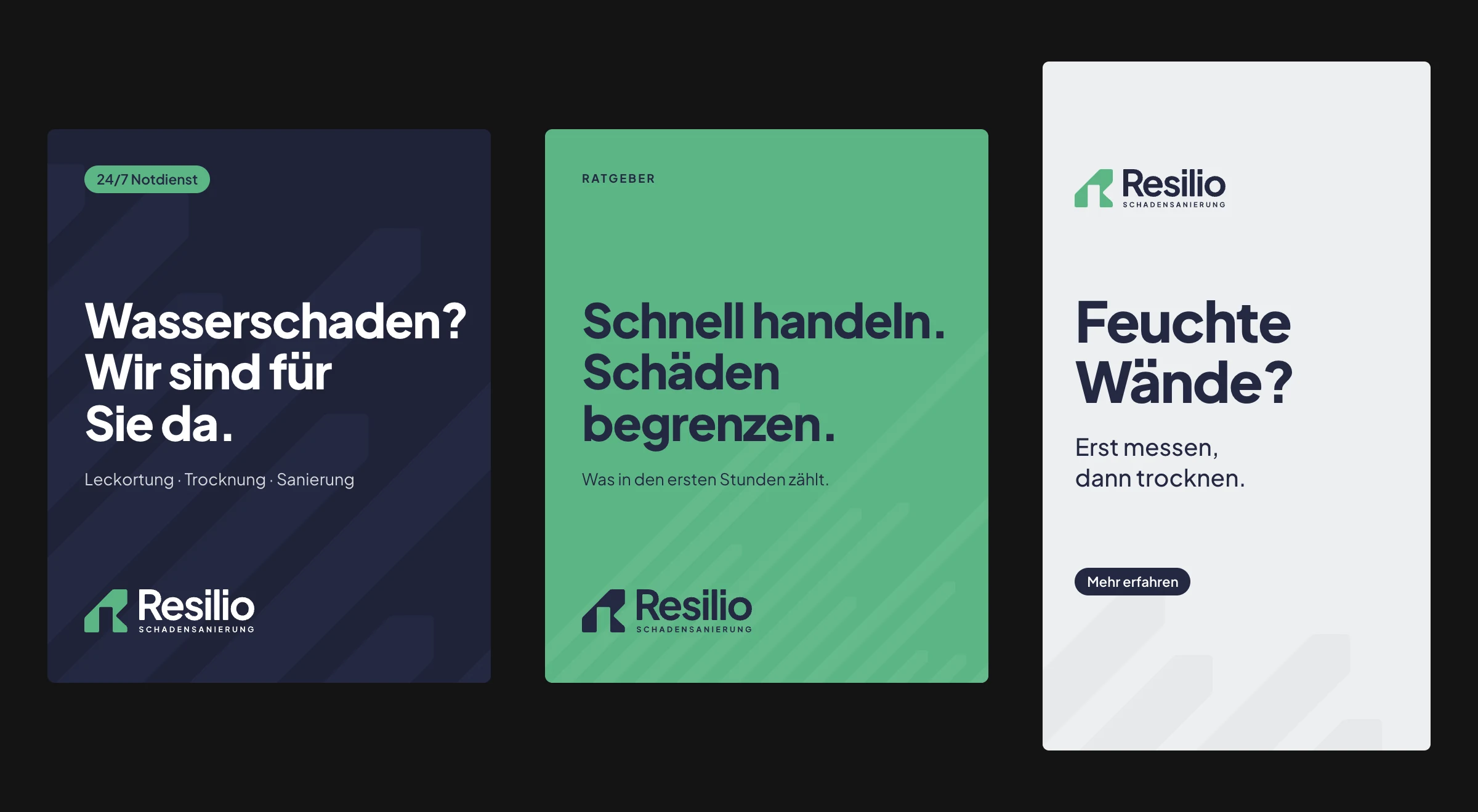
The pattern grows straight out of the logo mark: the 45-degree roof line is extended into a stripe while the arrowhead stays intact. This results in two patterns: the bold arrow bundle and the fine, technical fine line.
Both are always tone on tone: the stripes are just a touch lighter or darker than the background. That gives surfaces structure without competing with text or logo. The more text an area holds, the less pattern, which is why there are three levels of coverage. Try it out below.
Stationery
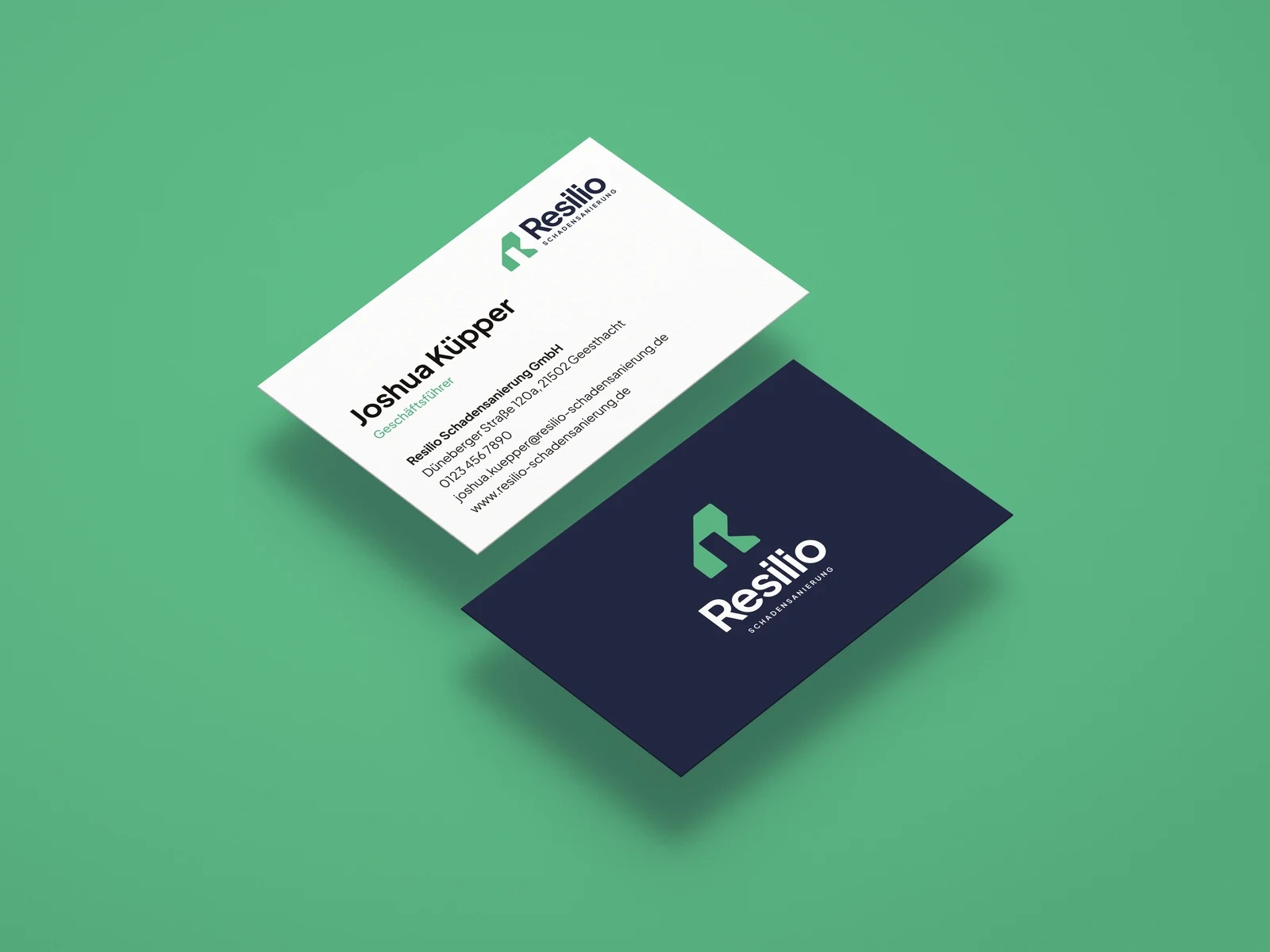
The business cards are white on the front with a clear hierarchy and solid navy with the logo on the back, printed on uncoated paper.
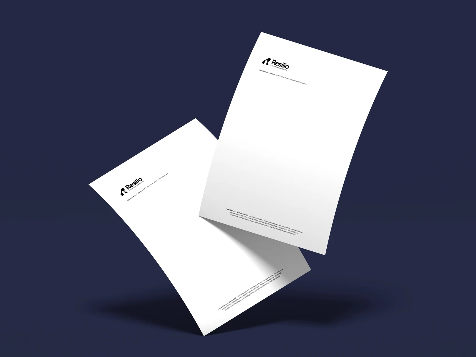
The letterhead is deliberately calm: plenty of white space, the logo at the top left, sender and company details set small in the footer.
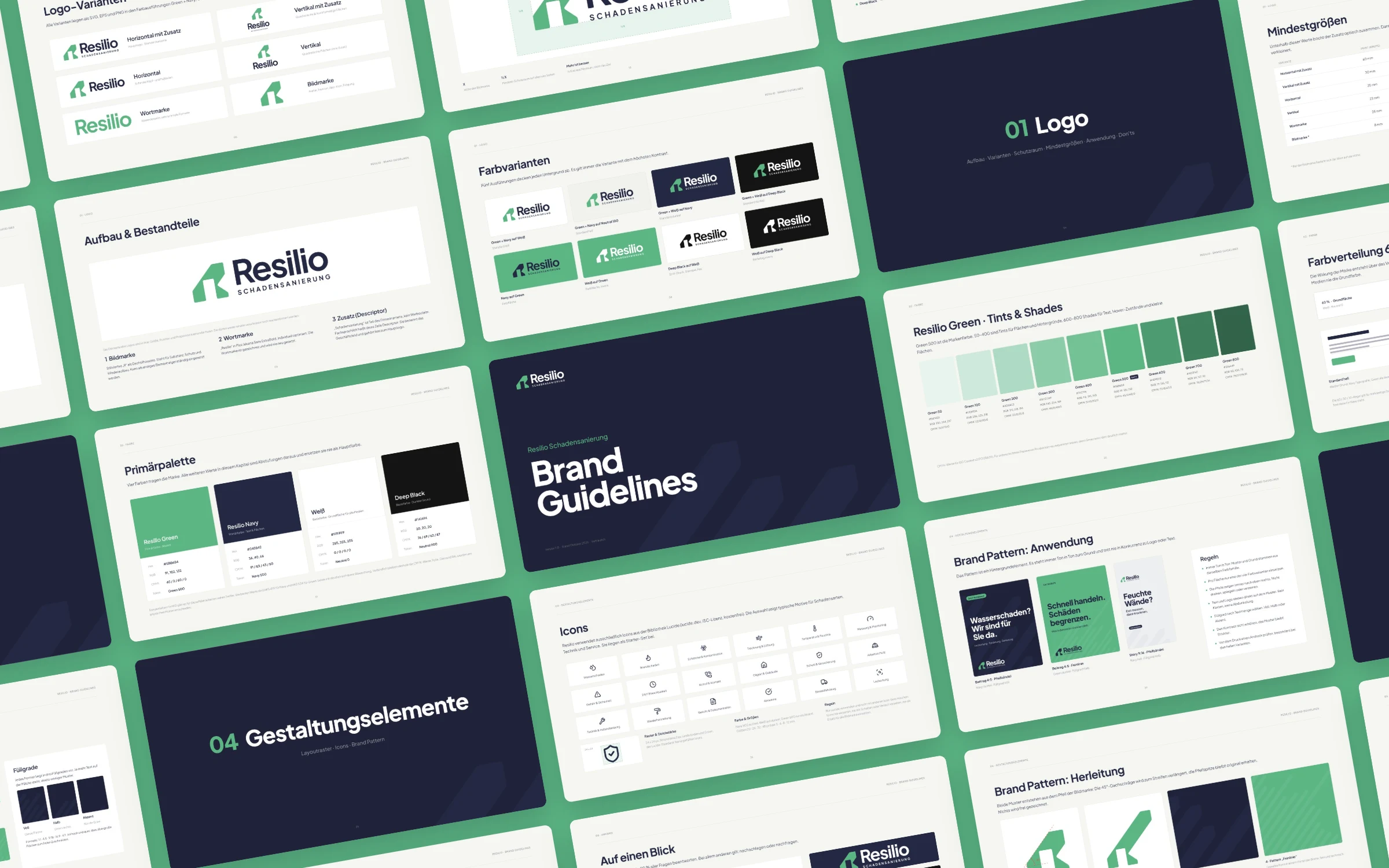
Brand Guidelines
To keep the brand consistent in everyday use, all rules are set out in brand guidelines: 45 pages on logo, colour, typography, design elements and application, including clear space, minimum sizes and contrast values.