STRYVE
Packaging
STRYVE develops innovative, user-friendly, and sustainable sports products that inspire their customers to unleash their full potential.
With a diverse portfolio featuring over 40 products, I played a crucial role in maintaining a cohesive packaging design across all items. Simultaneously, I took charge of identifying opportunities to enhance the packaging, ensuring efficiency in implementation without investing excessive time in adapting changes across the entire product range.
With a diverse portfolio featuring over 40 products, I played a crucial role in maintaining a cohesive packaging design across all items. Simultaneously, I took charge of identifying opportunities to enhance the packaging, ensuring efficiency in implementation without investing excessive time in adapting changes across the entire product range.
Packaging Examples
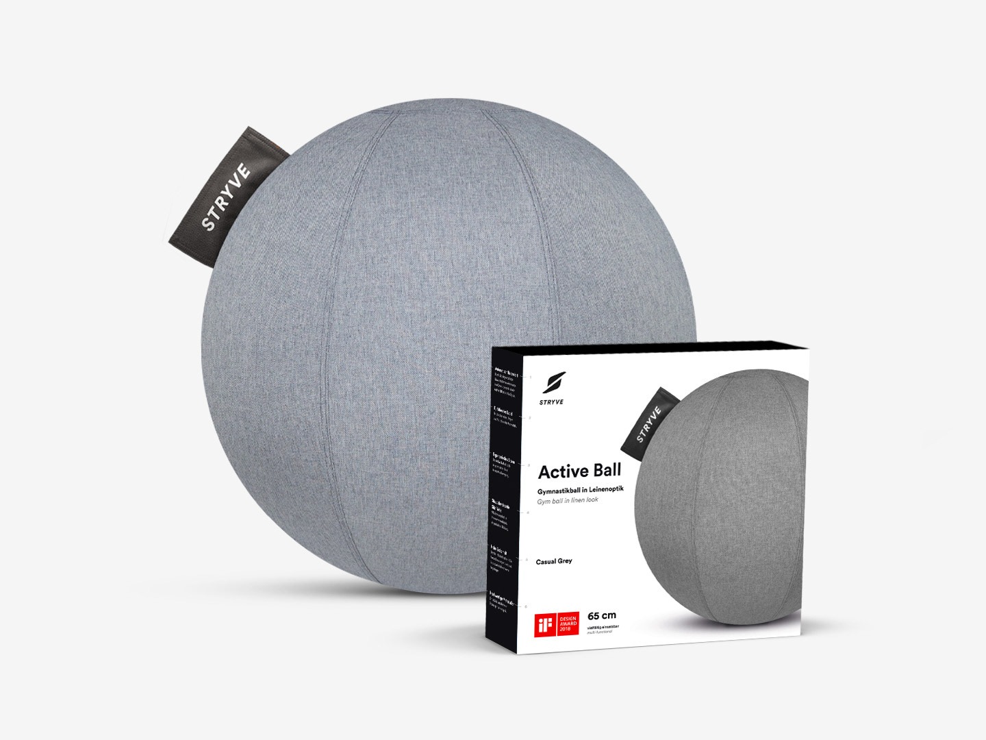
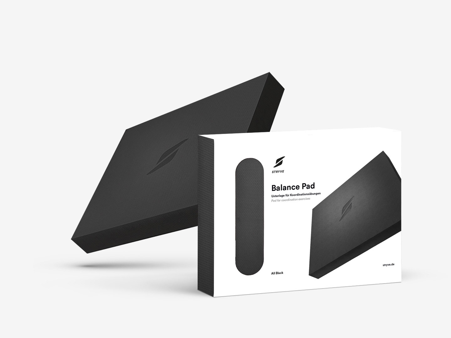
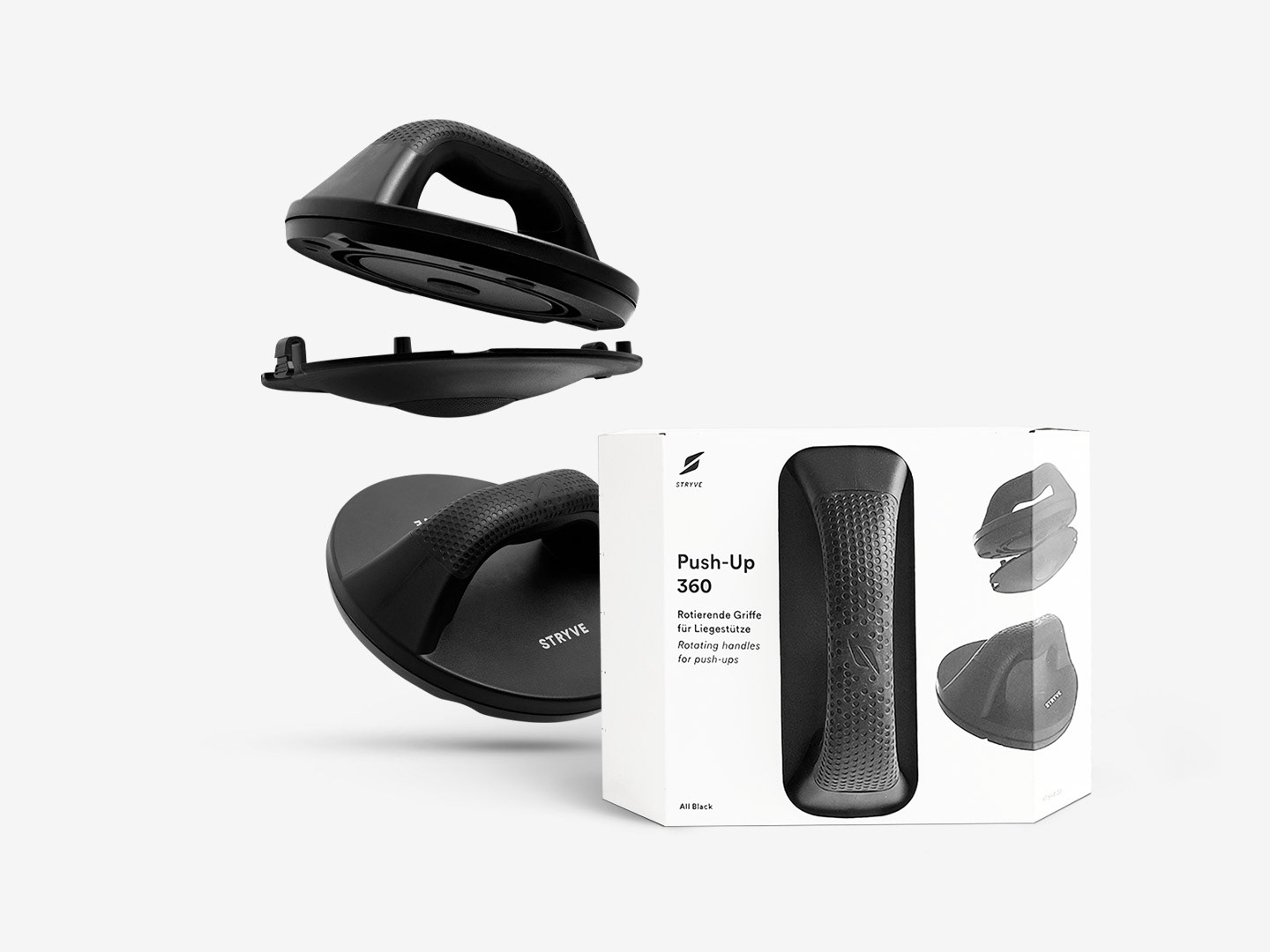
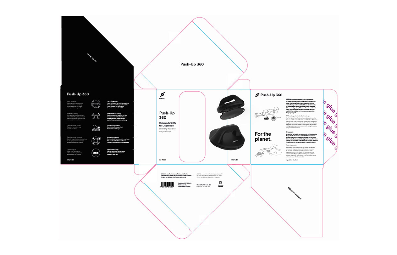
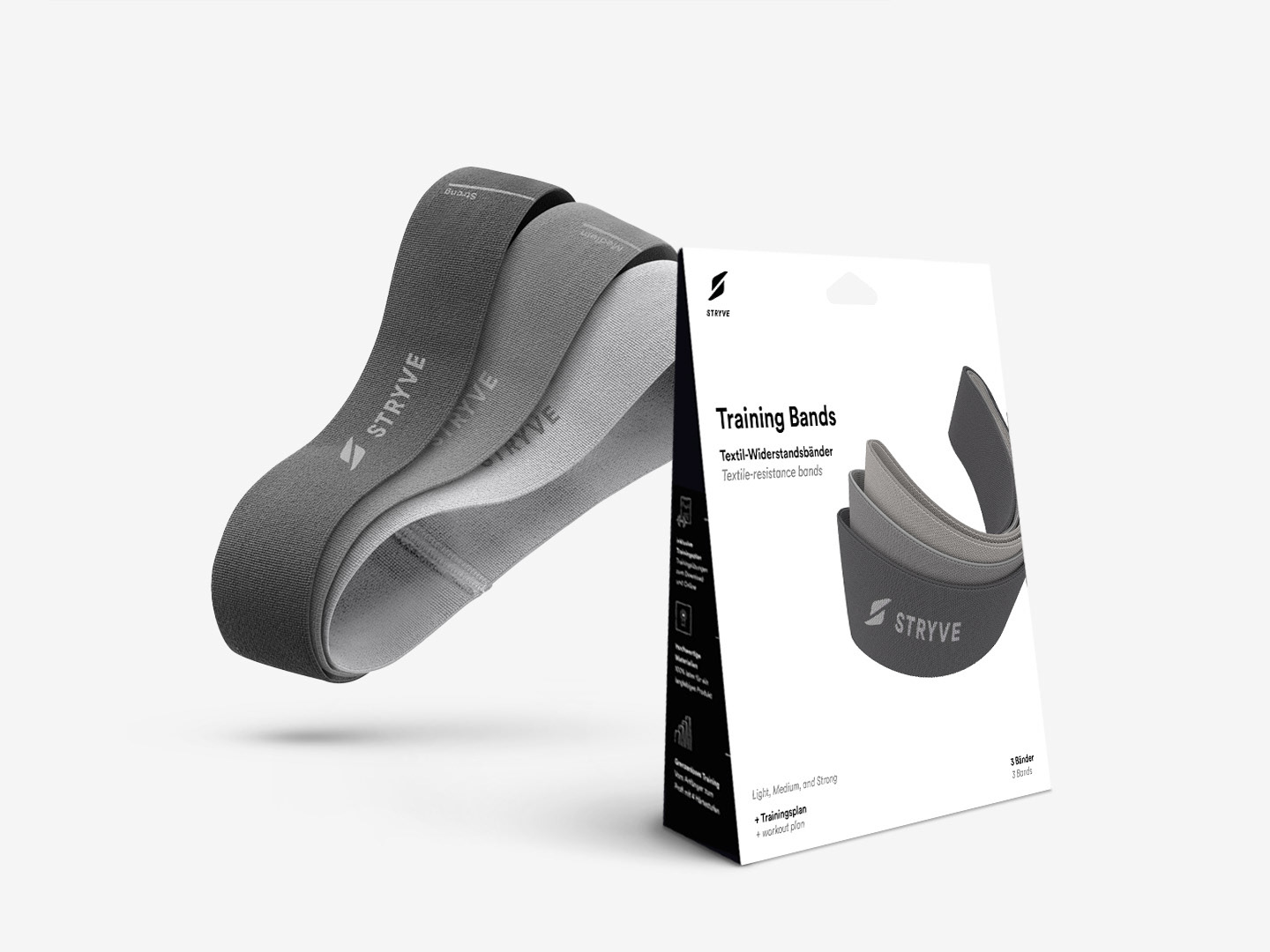
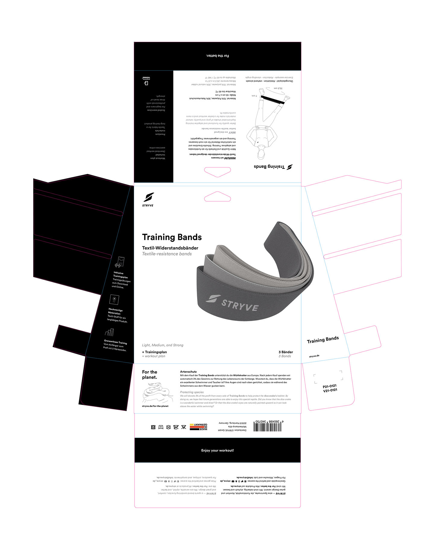
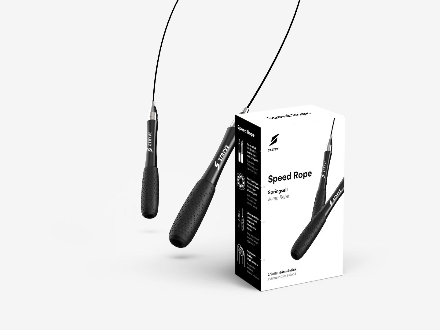
Here is a selection of packaging designs that I have created for STRYVE.
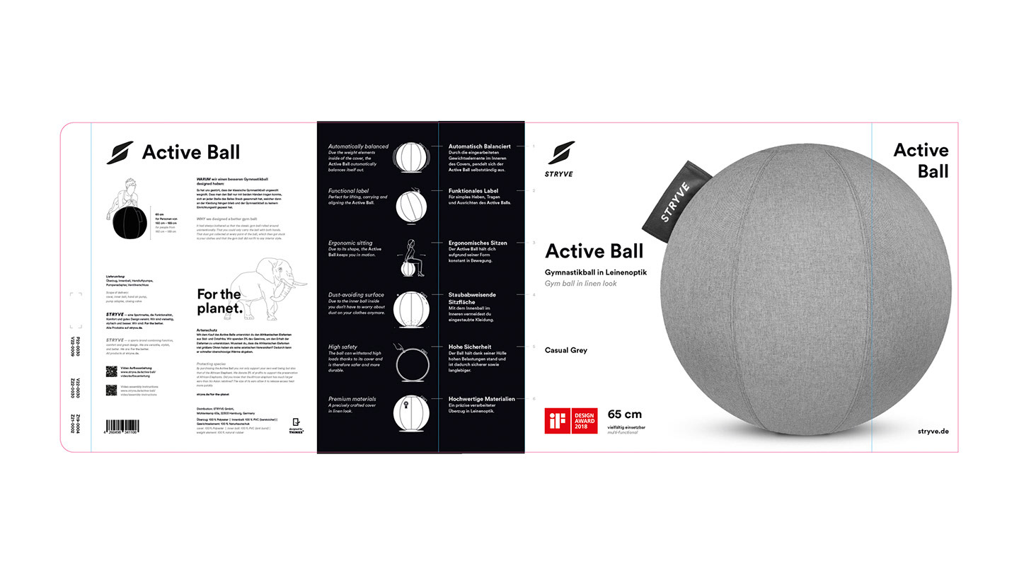
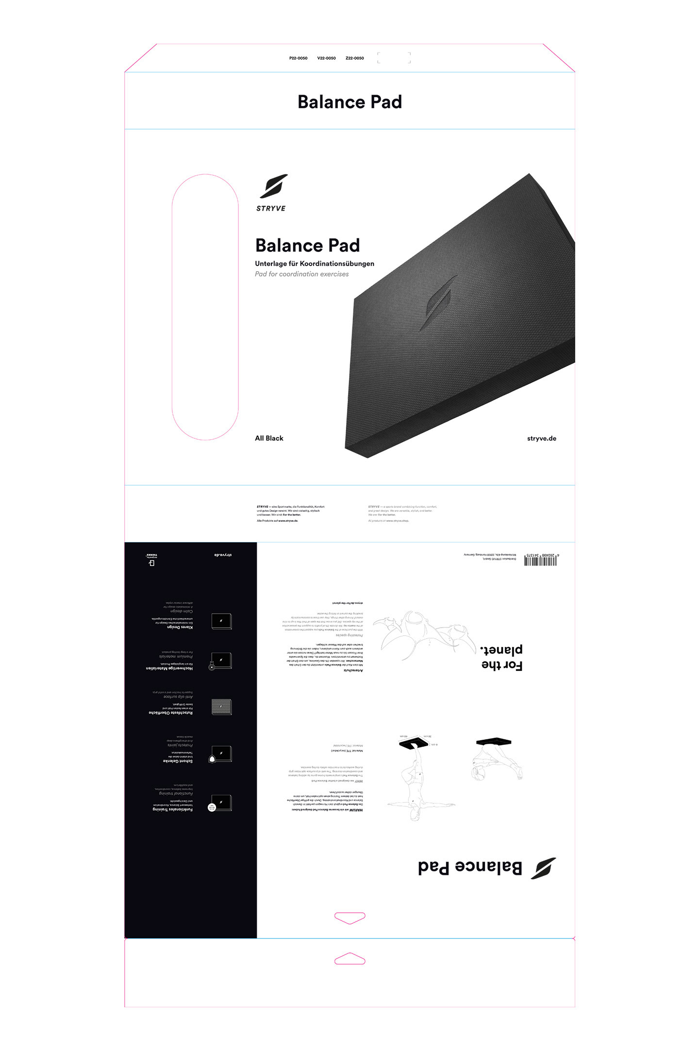
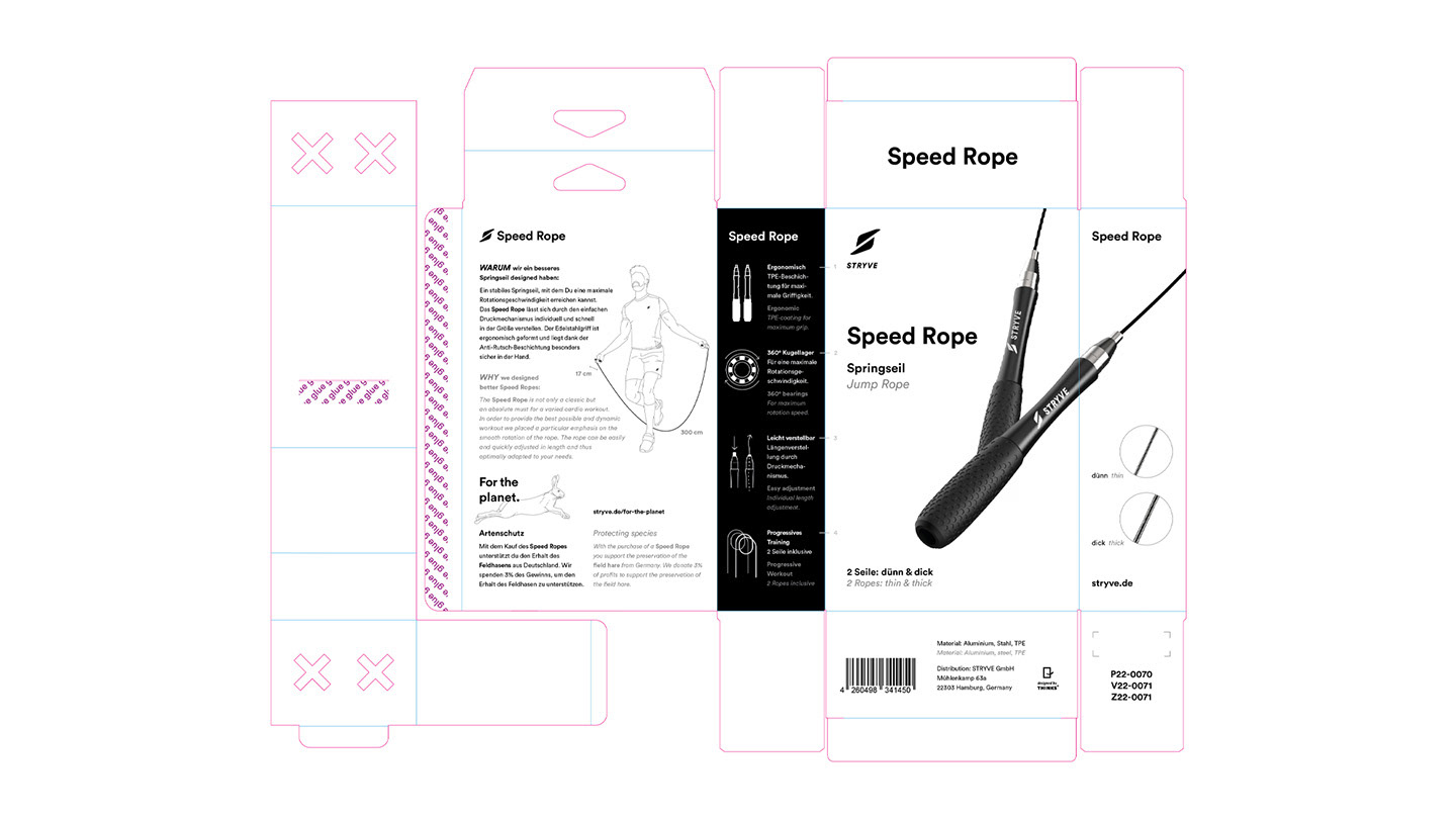
All packaging is based on the same fundamental elements to create a cohesive overall image: a product description, a Hero Shot of the product, the product name, a subline, logos, features and icons, illustrations (person with product and animal), product dimensions, URL, the "Designed by THINKS" seal, a "For the planet" text, material composition, article numbers, EAN code, STRYVE text, and color (if there are multiple color options).
Of course, there are exceptions as well: Some products, for instance, may include workout plans or have won a design award. Additionally, there are cases where certain basic elements must be omitted due to space constraints.
Depending on the size of the packaging, uniform font sizes are also taken into consideration.
